Who are we kidding? It's always a good time to make a new Ghost theme and making a new Ghost theme is always a good time 😉
I made the first commit to my current Ghost theme, Smart, 4 years ago. It looked a bit different back then, with a different purpose and set of goals. At the time, I was a philosopher, writing on the epistemology of biology—but life moves on.
When I first designed the theme, the idea was that it would be free, open source, and usable by anyone. While it's still free and open source, "usable by anyone" turned out to be too onerous of a requirement. It limited personalization, experimentation, and development, so I ended up deprecating public support.
In its current state, I actually really like my Smart theme. A few rough edges remain but it mostly does what I want. So, it makes prefect sense that I want to jettison the whole thing and start from scratch. Again 🤷
The design inspiration for the new theme is mid-century modern graphic design. Or, it was. Before that version, the inspiration was techno dystopian manifestos. Suffice it to say, there's been several designs and redesigns of what this new theme could be.
Instead of starting from a design motif, this time I started from what I wanted the theme to do.
Or, actually, what I didn't want it to do.
No
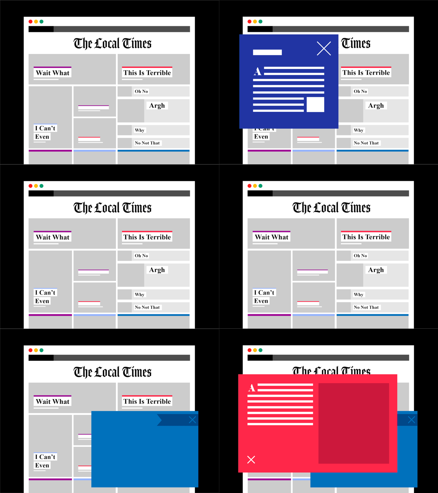
Do you ever read your local news without an ad blocker? It's like playing Where's Waldo to find the actual story. Ads crowd the screen. Videos play out of nowhere. Pop ups everywhere. The chumbox stinks. And the design utterly sucks.

These complaints are nothing new, only indicative of a failed business model that's inching us toward our techno dystopia.
Yes
Instead, I'm starting from the radical idea of providing a pretty good reading experience. What that means, of course, is subjective, but in contrast to the above I have the luxury of only populating the viewport with the essentials. No pop ups, autoplay vids, or ads.
It's just the text and a few features to enhance the reading experience, especially in respect to content about web dev.
More concretely, these are my requirements for the new Ghost theme.
Compatible with Ghost
As a Ghost theme, I guess the theme should work with Ghost. In addition to the essentials, I also want to customize editor cards, add welcome pages, and more TBD.
Features
Then, I have some features to add that I can't live without. In no particular order:
- Table of contents
- Share links
- Code highlighting
- Automatic dark mode
- Social media links
- Image zoom
- CI/CD with GH Actions
Totally unnecessary features
These features I can live without, but they make the site a little bit more fun.
- Music player that features my latest mix
- Bookshelf that highlights my latest reads
Experiments
I also have some things I want to test out.
- HTMX for seamless transitions
- Custom build process
Design
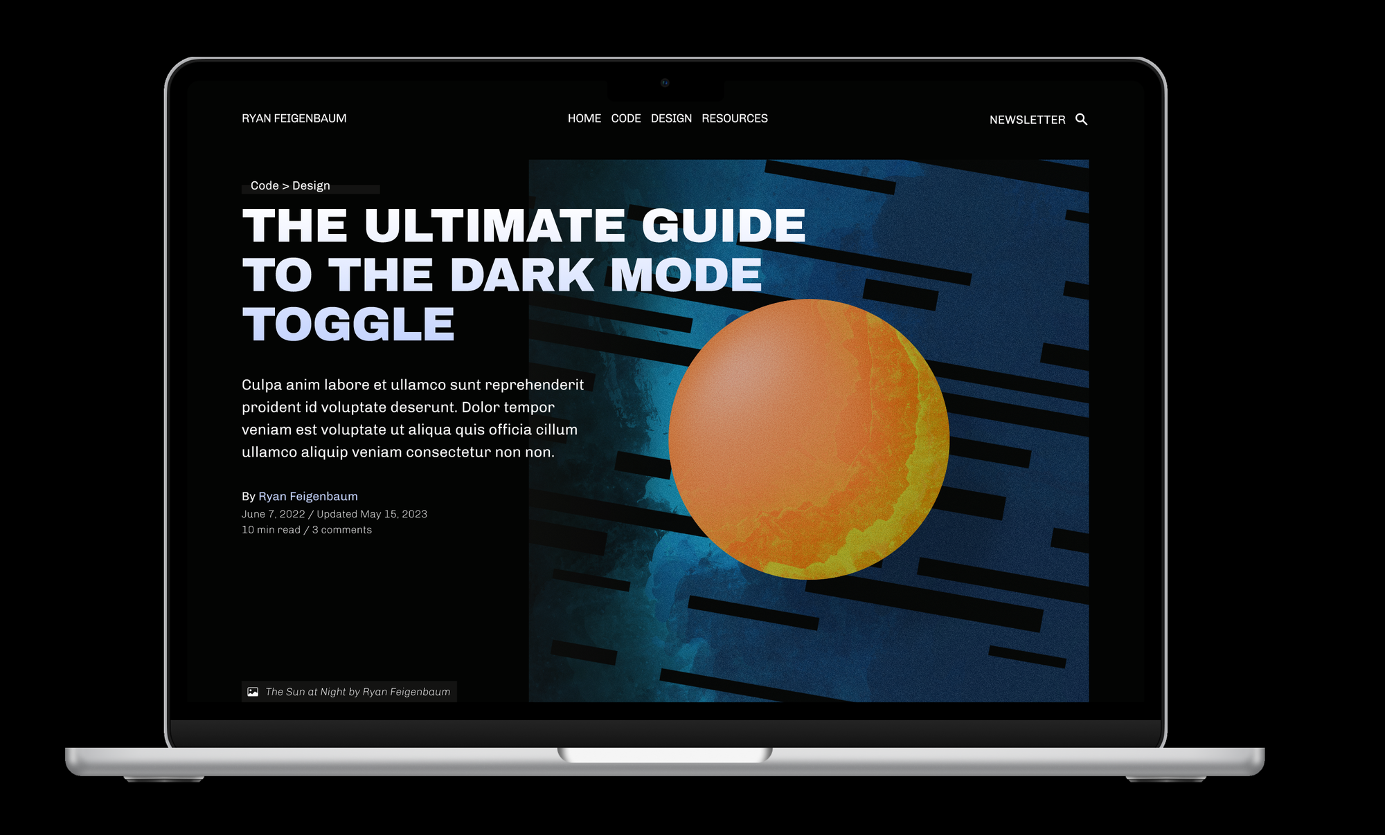
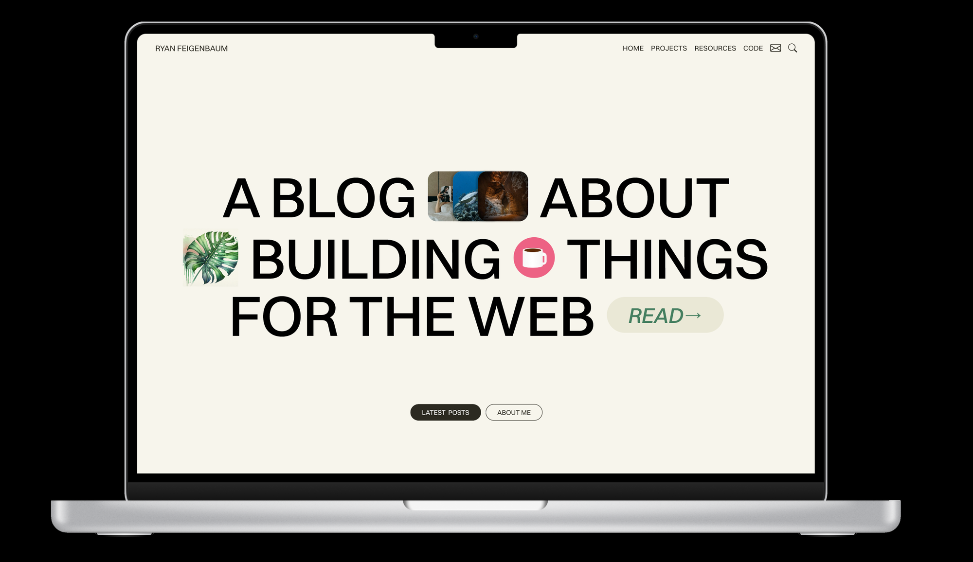
As mentioned, the goal for the theme's design is to provide a pretty good reading experience. Here are a few screenshots of the design in its current state:
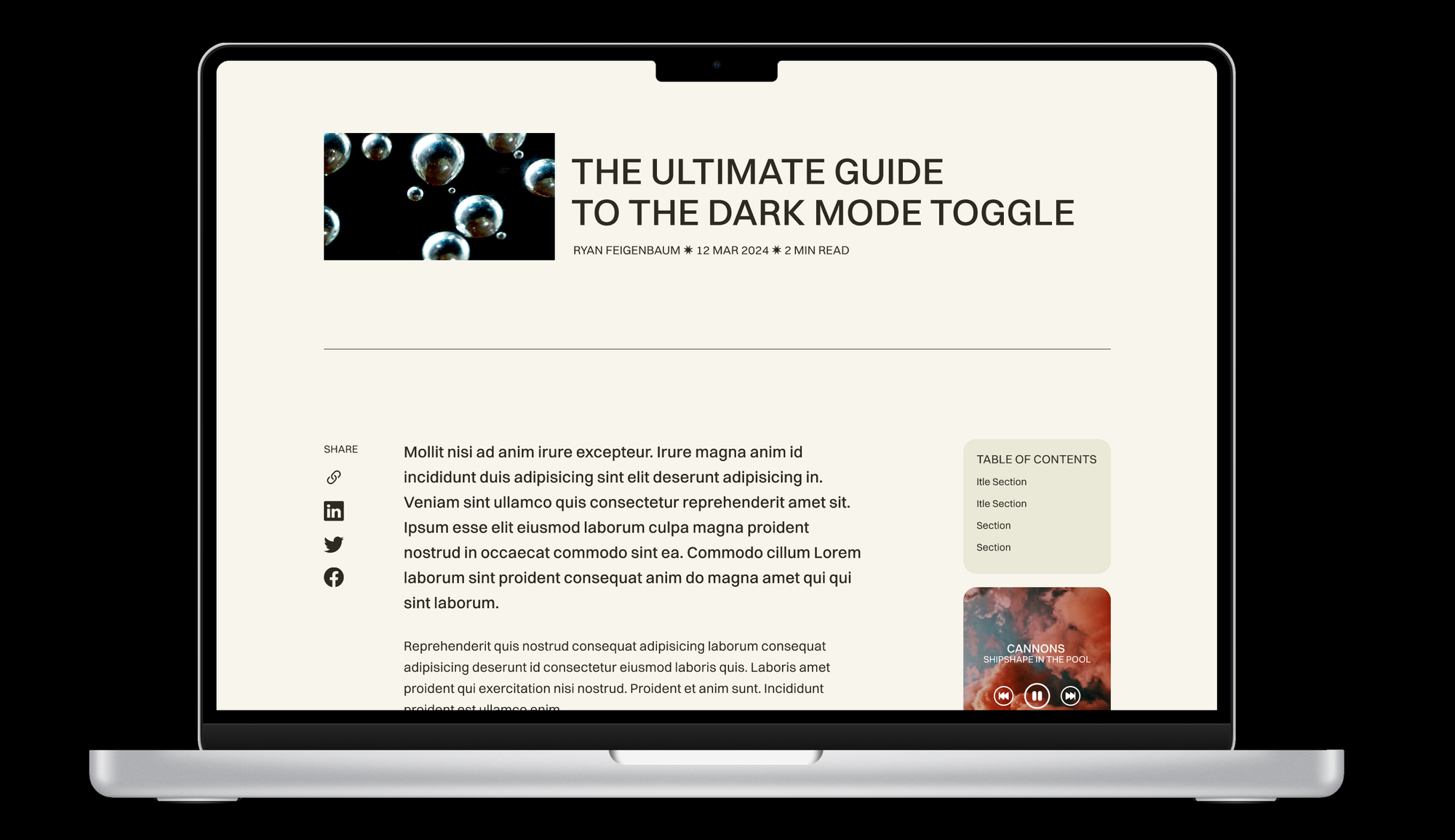
Here's the question. Would you be interested in seeing me code this theme on stream? Leave a comment and let me know!


