In the HTTP Archive's 2021 Almanac, they found that images are the single greatest contributor to page weight or the "total number of bytes of a particular web page." Images outpace all other content (JS, CSS, and HTML) by over 70% in a measure of median bytes by content type. Put another way, if your site is loading slowly (or not as fast you'd like), images are probably the chonk.
The good news is that Ghost automatically optimizes local images you add in the editor, generating different sizes relative to the user's viewport, adding size attributes to avoid jank, and lazy loading off-viewport images. But what about images that show up elsewhere in your theme like a hero or card image?
While Ghost provides several tools to optimize these images, it's up to theme developers to implement them. This tutorial will show you how to optimize images anywhere and everywhere in your Ghost theme.
Set Your Image Sizes
Let's say you have a header image for your post. The reader's device will determine the optimal size for that image. For example, if your reader is on an ultrawide monitor, you may need to serve a 2000 px image, but serving that same image to a reader on a phone that has a screen that's only 360 px wide is a waste of pixels, data, and loading time. Ideally, then, you'd serve a 2000 px image to the first reader but a 360 px image to the second.
Ghost allows you to generate a set of images at specified sizes so that you can do just that. These images are defined in the package.json file located at the root of the theme. Which sizes you want to generate will be determined by the needs of your theme. The JSON snippet below shares the image sizes I use for my theme. The size names ("s", "m", etc.) can be anything you want.
{
  "config": {
    "image_sizes": {
      "xxs": {
        "width": 50
      },
      "xs": {
        "width": 100
      },
      "s": {
        "width": 350
      },
      "m": {
        "width": 500
      },
      "l": {
        "width": 700
      },
      "xl": {
        "width": 1000
      },
      "xxl": {
        "width": 2000
      }
    }
  }
}
Whenever a particular image size is requested, it's generated on the fly by the server and cached. To control your site's size on the server, Ghost recommends not having more than 10 defined image sizes.
Once your images sizes are defined, you then can use them in your theme.
Images in Your Template
The images sizes you defined above are available in your theme via the image helper. The basic syntax is {{img_url feature_image size="m"}}. Here, the size attribute calls in the image you defined in your package.json file above. You can then string these image sizes together to build out a set of images in your template's Handelbar file.
 <img class="post__feature-image"
      srcset="{{img_url feature_image size="m"}} 500w,
              {{img_url feature_image size="l"}} 700w,
              {{img_url feature_image size="xl"}} 1000w"
      src="{{img_url feature_image size="l"}}"
      sizes="(min-width: 48rem) 700px, 100vw"
      alt="{{#if feature_image_alt}}{{feature_image_alt}}{{else}}{{title}}{{/if}}"
      width="2240" height="1680"
>
Let's walk through the markup to understand what's happening.
Source Set
srcset defines the set of images from which the browser can choose. The first part contains the Handlebars markup and helpers provided by Ghost that pulls in the resized images specified above. After that, you let the browser know the intrinsic width of the image by giving the pixel value followed by w. These values will match up with those in the package.json file.
Source
src specifies the fallback image. If the browser can't choose from the srcset, the src image will be used. It usually works to choose the middle image here.
Sizes
sizes is the trickiest part of the markup but the most powerful. While the browser can automatically try to choose from the set of images provided, sizes gives precise instructions on which image to choose.
In the sizes statement above, we tell the browser to use the 700 px image whenever the viewport is wider than 48rem. Otherwise, we tell the browser to find an image that matches the width of the viewport (100vw).
Alt
Essential to accessibility and SEO, the alt tag also leverages Ghost's Handelbars templating layer to either use a supplied alt tag, entered via the post editor, or uses the post's title as a fallback.
Width and Height
The width and height attributes refer to the intrinsic size of the image. Even though the image size is responsive, telling the browser the intrinsic image size helps avoid jankiness when loading since the browser can predict how much space the image needs on the page.
Bonus Points
With widespread support of the image format webp, it's time to use it with wild abandon. On average, webp images are 25% - 34% smaller than jpegs. Webp also supports animation and transparency.
At the moment, Ghost doesn't support serving different image formats, so if your audience is using primarily unsupported browsers, you'll likely want to account for that by using different formats. There are also some cases where webp could result in a larger image, so do your homework.
To convert images to webp, Google's Squoosh app is pretty fantastic. I also really like XnConvert, which is a powerful, cross-platform batch converter/compressor.
 GOUGELET Pierre
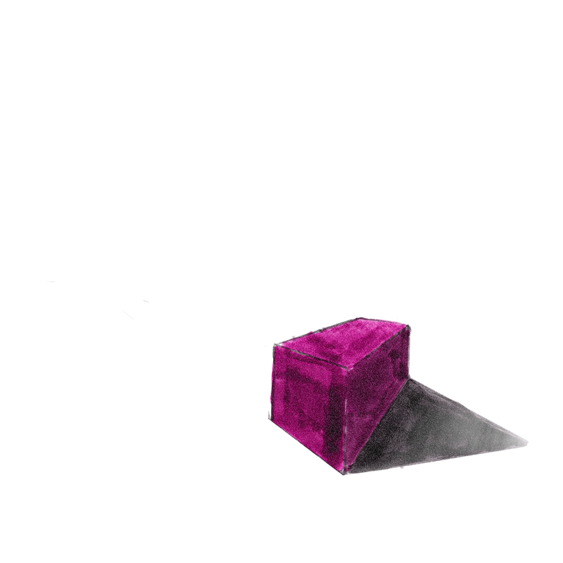
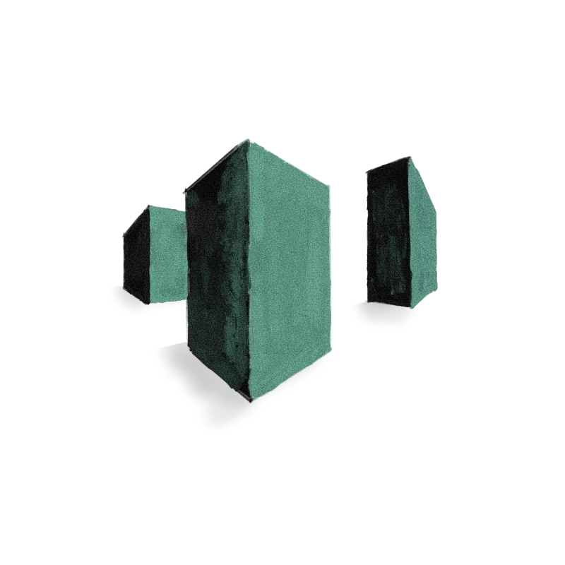
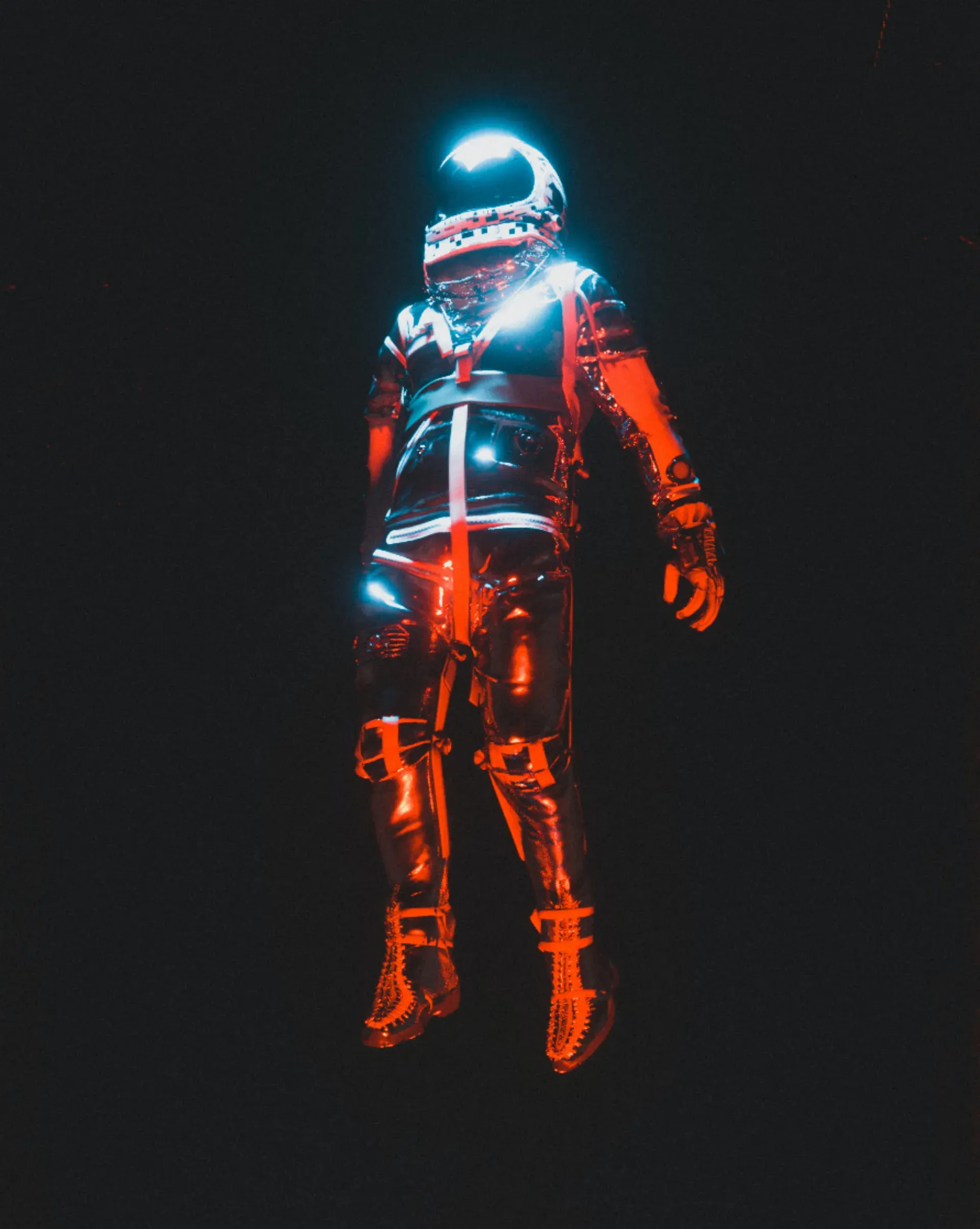
Below is a dope render by Cash on Unsplash. Converting from jpeg to webp resulted in a 62% reduction in file size!

If you've been making your way through this tutorial and you realize you need a refresher on responsive images, MDN has a fantastic guide to the basics. I also found the articles below helpful:
 Barry Pollard
By combing all the techniques above, you can optimize your images for your Ghost theme, get rid of the jank, and reel in those Lighthouse points. 💯