No one ever said, “Please make me wait longer.” But if you’re not optimizing the images on your website, that’s exactly what you’re doing: you’re making your users needlessly wait and wasting their mobile data along the way.
Adding fuel to the fire, the HTTP Archive’s 2022 Almanac found that images are the most significant contributor to a webpage’s weight, accounting for around half its size.
Optimizing images, then, is a no-brainer. It’s the best target if you want to max out your site’s performance, improve user experience, and boost your site’s search engine optimization.
In this tutorial, we’ll walk through the fundamental strategies for optimizing images for mobile browsers. The main idea is simple: reduce image size as much as possible without sacrificing its quality. I’ll explain the concepts, techniques, and tools you need to know to be an image optimization pro.
- Resizing images for big wins
- Compression lesson
- Formats for the win
- Load responsively
- Lazy loading for image optimization
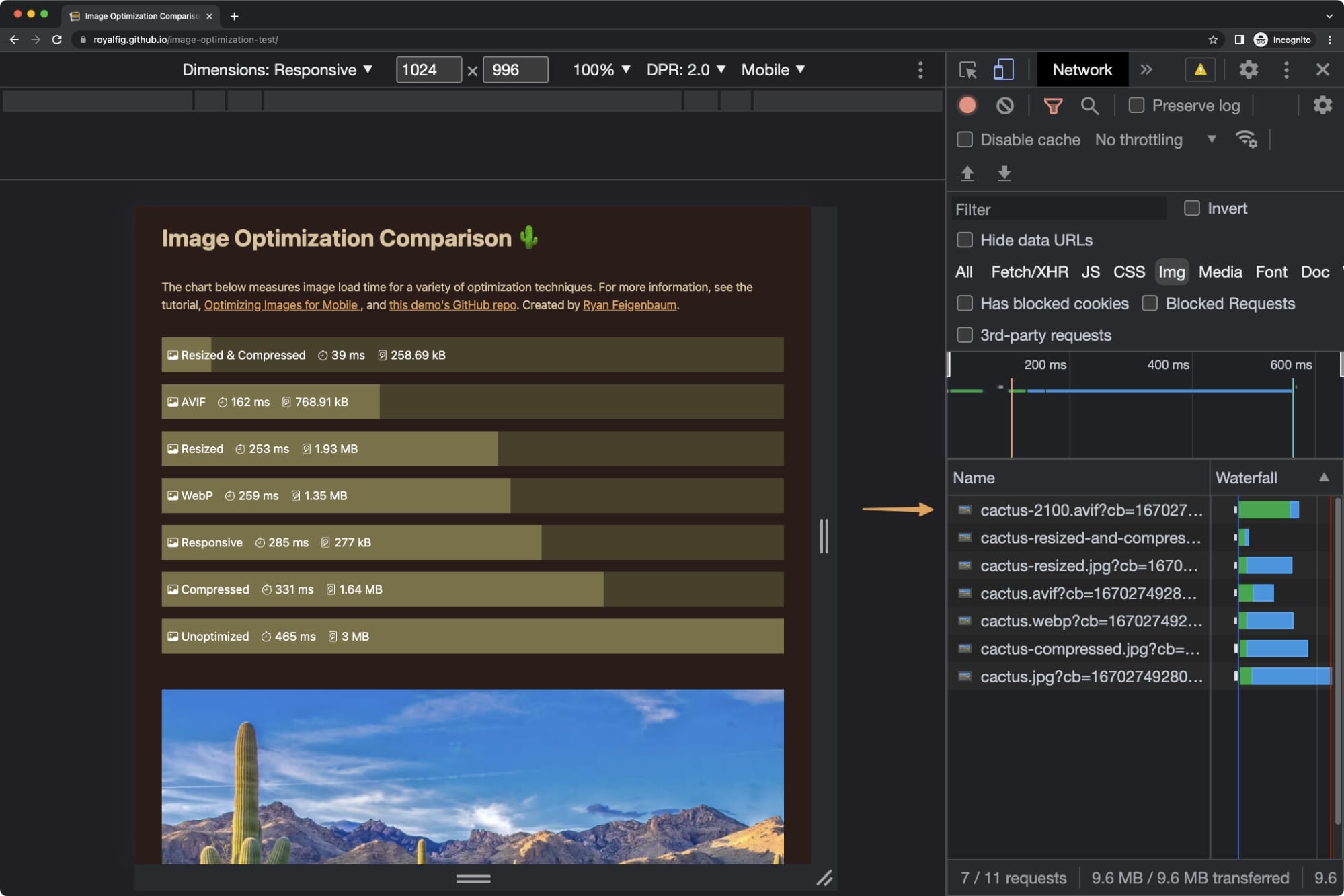
To help us visualize optimization performance, I created a demo that compares the strategies we’re going to discuss.
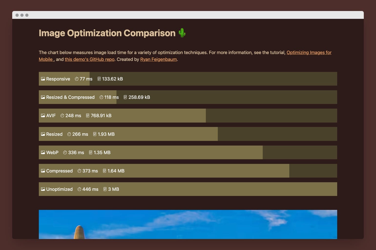
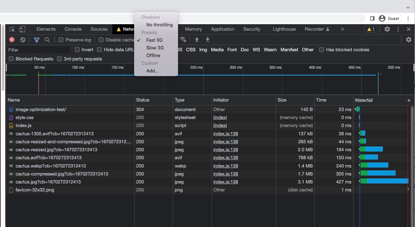
The demo gives an overview of image loading times and file sizes, as well as lets you compare the fidelity of different images. To exaggerate the results, use your dev tools to throttle your connection. Choosing Fast 3G, for example, will cause images to take considerably longer to load and accentuate the performance benefits from our optimizations.
Before getting into those strategies, let’s establish a baseline that we can use to measure our progress.
Behold this beautiful image of saguaro cacti by Dulcey Lima. The image comes from Unsplash, an amazing resource for finding high-quality images that are free to use.

Downloading this image from Unsplash yields a massive 4,678 by 3,175px JPEG that is 3MB in size. While that might yield a nice print, loading this image on a mobile device on a fast 3G connection takes over 53 seconds. That’s a long time to wait!
Given that an iPhone is only 390px wide, an image that’s 4,000 plus pixels seems just a bit overkill. Let’s get to optimizing by resizing the image to something more sensible.
Resizing images for big wins
Most image editors allow you to resize your images. Open the image in Preview (on a Mac) and adjust the size, or use PowerToys on Windows to do it right from File Explorer.
Any way you want to do it, the idea is the same: make the image smaller than before.
By resizing our cactus image to a width of 1,500px, we reduce our load time to about 47 seconds. That’s an 11 percent decrease. Ensuring that you’re serving the right-sized image is an essential first step in optimizing images for the mobile browser.
Check out the demo to compare the quality of the images.
But what size should you shoot for?
Generally, you want to serve an image that is equal in size to how it’s going to appear in the browser. For example, our resized image that’s 1,500px wide is perfect for a webpage where it’ll appear 1,500px wide. If the width were only 500px, then the optimal image size would be 500px.
We have a Goldilocks principle here: serve an image that’s just right, neither too big nor too small. (An image that’s too small will appear blurry and pixelated.)
A wrench in the machine here is that not all displays are alike. Depending on the device’s resolution, 500px isn’t always equal to 500px. With high-density displays, more than one physical pixel on a device constitutes one CSS pixel.
For example, the iPhone 14 display is 390px wide. However, each one of those pixels comprises three physical pixels. This ratio of physical pixels to CSS pixels is called the Device Pixel Ratio (DPR). On my Google Pixel 7, the DPR is 2.61. Visit whatismyviewport.com to see your current DPR.
DPR is important to understand because it affects our Goldilocks principle. For an iPhone 14, which has a DPR of 3, we would need to serve an image three times larger than its width on the page. That means a 500px wide container on the page requires an image that’s 1,500px wide. A desktop monitor, though, generally has a DPR of 1, necessitating a 500px wide image for a 500px container on the page.
As you might imagine, managing images for different DPRs could quickly become complex and tedious. Below, in the section on responsive images, I’ll share how we can leverage the <picture> tag to do this work for us. First, though, let’s discuss our next optimization strategy: compression.
Compression lesson
Image compression reduces an image’s size within a specified threshold by removing data using different algorithms. Compression can be lossless, in which image quality isn’t impacted, or lossy, which sacrifices a minor loss of quality for a substantial reduction in image size.
Image compression fits in as an optimization strategy because it works to reduce image size and decrease load times. Compressing our original cactus image saves us 1.36MB and reduces load time by 17 percent. By resizing and compressing the cactus image, we save 2.7MB compared to the original and drop the load time by a massive 81 percent!
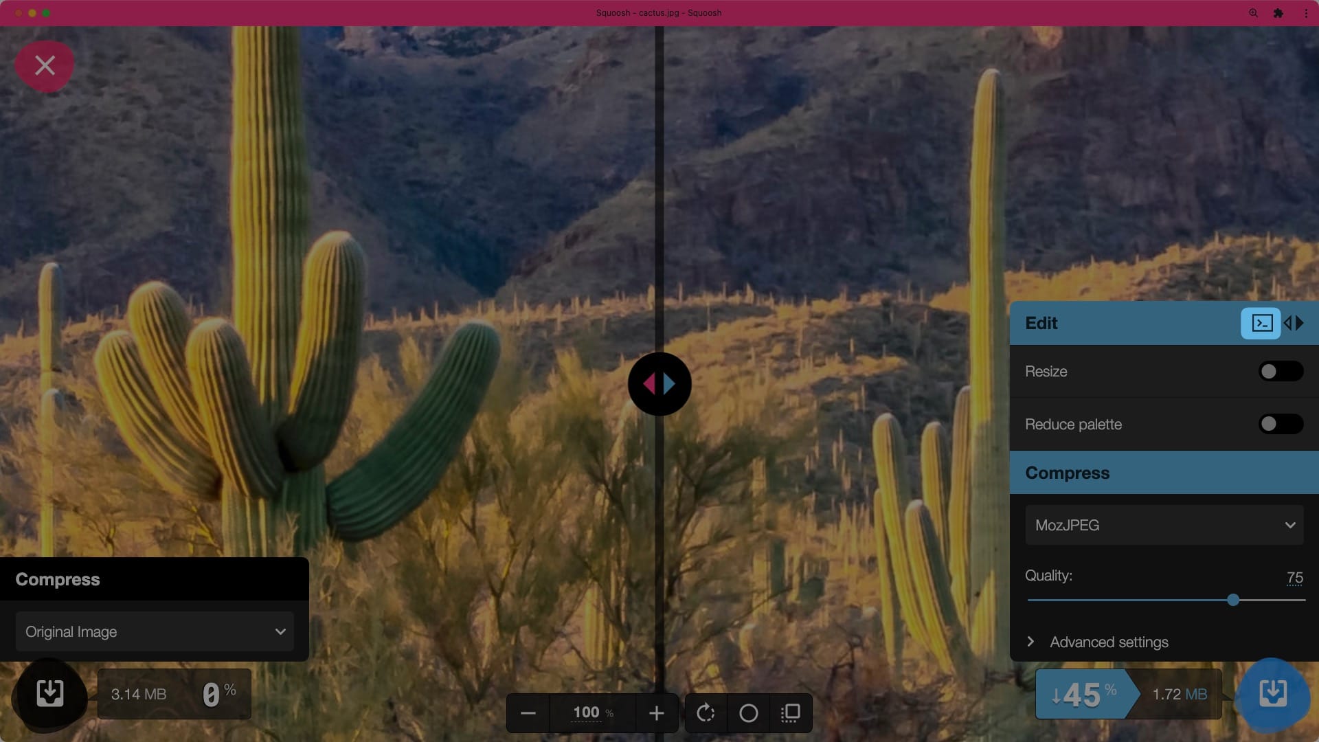
My absolute favorite app to use for resizing, compressing, and converting images is Google’s Squoosh–and not just because it has a fun name. With a downloadable web app and CLI tool, Squoosh provides an intuitive UI for quick image optimization.
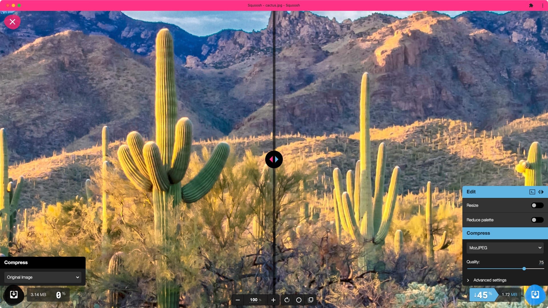
Part of this app’s power comes from the ability to convert an image’s format, which determines how it’s compressed. JPEG, PNG, and GIF are all common formats widely in use today.
Recently, two new, cutting-edge formats, WebP and AVIF, have come onto the scene. They offer significantly reduced file sizes without a significant loss of quality and have gained wide enough support in the browser to start using them in production.
Formats for the win
Released in 2010, WebP is a compression format that supports transparency and animation. At the time of writing, over 97% of browsers support it. Developed by engineers at Google, the format is intended to replace JPEGs.
In testing, engineers randomly selected a million images from the web (JPEGs, PNGs, and GIFs). They then re-encoded the images using WebP, which produced no perceptible degradation of quality and a 39% reduction in file size. When re-encoding our cactus image to WebP, file size is reduced by 55 percent and load time by 26 percent.
AVIF has a similar story. Developed by the Alliance for Open Media—which released this format in 2019—AVIF is currently supported in 76 percent of browsers. Netflix has contributed to the format’s development and created a benchmarking framework that shows outstanding results, in which AVIF even outperforms WebP in reducing image size without sacrificing image fidelity. When re-encoding our cactus image to AVIF, file size is reduced by 74 percent and load time by 53 percent!
Squoosh, the tool mentioned above, can convert images to both WebP and AVIF. I encourage you to try out an image to see the savings for yourself. The results are incredible.
Let’s take a second to recount our progress so far. Our goal here is to demonstrate the best strategies for optimizing images for mobile devices (which, by extension, applies to larger viewports as well). The basic strategy is simple: reduce file size without sacrificing quality. So far, we’ve reviewed how to achieve this by resizing, compressing, and using the latest and greatest in image formats.
But what if we could bring this all together? In the next section on responsive images, I’ll show you how to do just that: serve the perfect image every time.
Load responsively
With the HTML <picture> element, we can load the image in the right size and format, no matter the device. It ensures the best image-loading experience every time, taking into account a device’s DPR automatically.
Not to spoil the surprise, but using this method yields an unbelievable 91 percent decrease in load time and a 97 percent reduction in file size over the unoptimized cactus image.
As mentioned, the secret sauce is the <picture> element. I’ll first introduce the markup and then walk through what it means:
<picture>
  <source
    srcset="
      assets/cactus-300.avif   300w,
      assets/cactus-500.avif   500w,
      assets/cactus-700.avif   700w,
      assets/cactus-900.avif   900w,
      assets/cactus-1100.avif 1100w,
      assets/cactus-1300.avif 1300w,
      assets/cactus-1500.avif 1500w,
      assets/cactus-1700.avif 1700w,
      assets/cactus-1900.avif 1900w,
      assets/cactus-2100.avif 2100w
    "
    sizes="(max-width: 1300px) 100vw, 1300px"
    type="image/avif"
    height="747"
    width="1100"
  />
  <source
    srcset="
      assets/cactus-300.webp   300w,
      assets/cactus-500.webp   500w,
      assets/cactus-700.webp   700w,
      assets/cactus-900.webp   900w,
      assets/cactus-1100.webp 1100w,
      assets/cactus-1300.webp 1300w,
      assets/cactus-1500.webp 1500w,
      assets/cactus-1700.webp 1700w,
      assets/cactus-1900.webp 1900w,
      assets/cactus-2100.webp 2100w
    "
    sizes="(max-width: 1300px) 100vw, 1300px"
    type="image/webp"
    height="747"
    width="1100"
  />
  <img
    srcset="
      assets/cactus-300.jpg   300w,
      assets/cactus-500.jpg   500w,
      assets/cactus-700.jpg   700w,
      assets/cactus-900.jpg   900w,
      assets/cactus-1100.jpg 1100w,
      assets/cactus-1300.jpg 1300w,
      assets/cactus-1500.jpg 1500w,
      assets/cactus-1700.jpg 1700w,
      assets/cactus-1900.jpg 1900w,
      assets/cactus-2100.jpg 2100w
    "
    sizes="(max-width: 1300px) 100vw, 1300px"
    src="assets/cactus-1100.jpg"
    alt="Cactus image loaded responsively"
    height="747"
    width="1100"
  />
</picture>
The picture element contains three elements: an AVIF <source> element, a WebP <source> element, and the familiar <img> element.
If a browser supports the first format listed — AVIF in this case — then the browser will serve an AVIF image. If not, it’ll go to the next image in the list (WebP) until it finds a supported image type. The picture element, then, allows you to specify multiple image formats, while also ensuring that only supported image types are served to the user.
In our usage, the <source> element has five attributes. <srcset> defines the available images by their path and their width. 500w, for example, means that the image is 500px wide. The <srcset> above shows that there are ten different image sizes available. You can generate as many or few images as you need, but they should all have the same aspect ratio.
The type attribute tells the browser the MIME media type of the image. For AVIF, we use type="image/avif".
The next attribute is sizes, which can be the most difficult to wrap your head around. Sizes uses media queries to tell the browser what size image it should use based on the user’s viewport.
For the cactus demo, the sizes definition is "(min-width: 1300px) 1300px, 100vw". This says that if the viewport is 1300px or larger, use an image that is 1300px wide. Because I set a max-width on the container of 1300px, I’ll never need an image wider than 1300px.
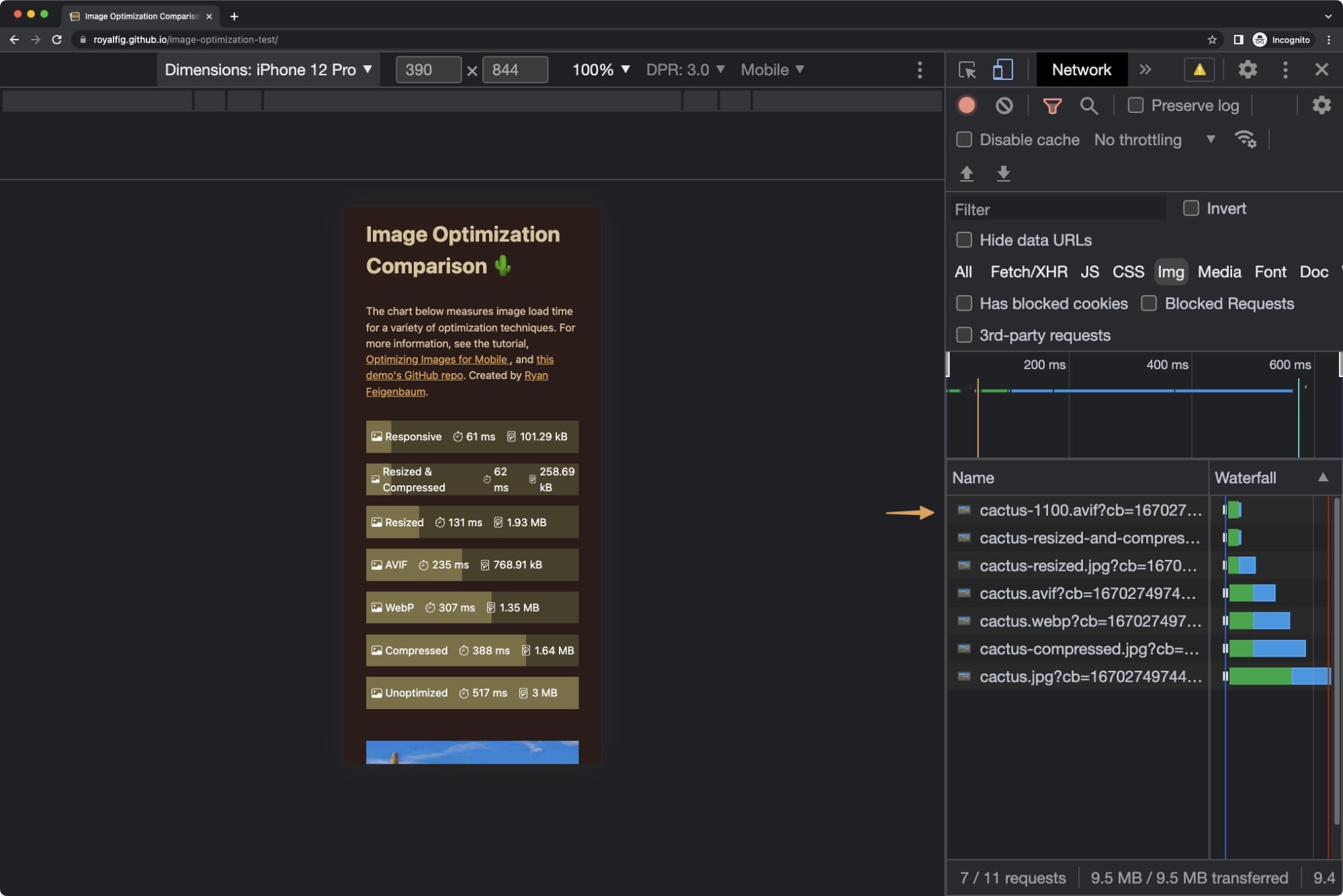
And, whenever the viewport is smaller than 1300px, the browser should serve an image that’s about the width of the whole viewport or 100vw. If the viewport is 500px, then the browser will serve a 500px image. In the demo, you can test this by resizing the browser, refreshing, and looking at the image name in the network tab in Dev Tools. You’ll see the size of the images adapting to the size of the browser. Pretty cool.
The clever part here is that the browser takes into consideration the DPR of the display. If the mobile device has a DPR of 2, then it’ll serve the largest image possible (2100px, in our case), when the viewport is over 1300px. You can test this out by opening the image optimization demo in responsive mode and changing the DPR. You’ll see that the browser will fetch a different image when that value changes.
The final attributes to add to the <source> element are width and height. This might seem a bit counterintuitive, as the whole point here is to serve images with different heights and widths, but setting height and width on images is important again.
Setting width and height gives the browser a hint at how much space your image will take. Having this information lets the browser reserve the appropriate room for an image and prevents the janky experience where the page jumps after images load.
But which height and width do we use? I think Chip Cullen’s advice is the best way to go: use the width and height of the fallback image. In the demo, that’s width="1100" and height="747". Notice that we omit the unit.
The <img> tag follows the same pattern with two additions. Add an alt tag to improve accessibility and SEO, and use the <src> element to specify a fallback image, in case the other markup isn’t supported.
Whew! Take a breath because that’s everything you need to know about using responsive images to optimize user experience on mobile browsers. As you can see, responsive images require a lot of markup.
To make your life easier, choose a platform or tool that supports responsive images out of the box. For example, the publishing platform Ghost optimizes images for you automatically and provides helpers to facilitate generating your own. The static site generator 11ty provides an image plugin that does the same. Gatsby, Next.js, and other platforms also include this functionality.
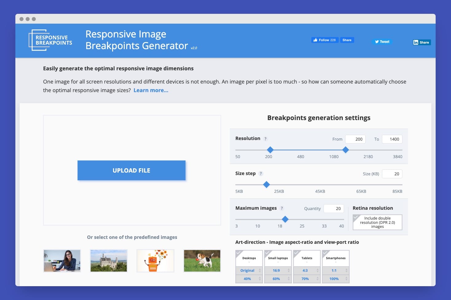
Another fantastic tool is Cloudinary’s Responsive Image Breakpoints Generator. You upload your image, specify your breakpoints, and then Cloudinary generates the images and markup for you. In addition to this tool, Cloudinary also provides a cloud-hosting service for images, which uses even more sophisticated techniques than the ones mentioned here to serve the perfect image automatically.
Different command-line tools are also available to generate responsive images. For the cactus demo, I wrote two scripts to generate all the images. One script uses ImageMagick and the other uses Squoosh. Ultimately, Squoosh gave me better results, so I ended up using the images it generated.
A quick tip: in the Squoosh web app, there’s a CLI button that’ll copy the code to perform the image transformation in JavaScript. It’s helpful because you can use the UI to define your resize value, format, and other options and then copy the code directly.
You might’ve thought you were done, but now’s not the time to get lazy because there’s a final optimization strategy to discuss: lazy loading.
Lazy loading for image optimization
Our guiding principle has been to serve the right size image, in the smallest file size, with sacrificing as little image quality as possible. That’s a mighty fine principle, except for one fatal flaw. A user may never scroll down far enough to see an image that has thus been downloaded in vain.
Lazy loading takes care of this problem by only downloading an image when a user is guaranteed to see it. With lazy loading, if the user never makes it all the way down the page, then those images at the bottom aren’t loaded at all. Consequently, your webpage loads faster and the users download less data.
Until recently, lazy loading required editing your HTML markup and using a JavaScript library. However, it’s now as simple as adding loading="lazy" to any <img> element, along with the width and height attributes mentioned above. That’s it! Lazy loading is now enabled for your images with support in over 92 percent of browsers.
Lazy loading works best for images that are outside the user’s viewport (offscreen). Don’t use the attribute with images above the fold, as those images should load right away.
Image of perfection
Given all of the technical details we covered, let’s recall why we should optimize images in the first place. We want to give our users the best experience possible, which means not making them wait when they don’t have to. These optimization strategies have the added benefit of improving our site’s SEO.
From resizing, to compression, to cutting-edge formats, to combining everything into the powerful picture tag–you’re now armed with everything you need to know to optimize images for your websites.
What are you waiting for? Get out there and optimize.