Your reader just finished reading your spicy new post and is excited to share it with their chums on Facebook. Only, there's a problem. There's no share button in sight.
The moment passes, and the opportunity for you to go viral is lost. Forever 💀
For you, the content creator or web developer, the problem is an absolute dumpster fire of available solutions. They're clunky, privacy-invasive, locked behind paywalls, or an ungodly mixture of all three.
There's got to be a better way.

Introducing the <share-button>
Meet the <share-button>, a custom web component I created to solve this exact problem.
Go ahead and try it out 👇
BTS: How It Works
We use custom web components just like a <button> or any other standard HTML element, except we can make custom web components do whatever we want: <custom-video>, <podcast-player>, <toaster-oven>.
They can be used to tackle a small problem like the share button or to build an entire platform like YouTube.
<yt-image alt="" ftl-eligible="" notify-on-loaded="" notify-on-unloaded="" class="style-scope ytd-thumbnail">...
</yt-image>
Real example of a YouTube custom web component
And, they're picking up steam 🚂
Custom Web Component Resources
- Awesome Standalones - Dave Rupert
- The Good, The Bad, and The Web Components - Zach Leatherman
- If Web Components are so great, why am I not using them? - Dave Rupert
- Learn Web Components - Web Dev Simplified [Video]
- Using Web Components for What They're Good At - Nolan Lawson
- An Attempted Taxonomy of Web Components - Zack Leatherman
I built the share-button component to be used without fuss, with sane defaults, and room for customization when needed. The code is open source and PRs are welcome!
How to Use It
I give the TL;DR version here, but check out the full docs to see all the available options.
- Load the Code
Add the following script tag to your site's head. This loads the code that makes the button work.
<script defer src="https://unpkg.com/@royalfig/share-button/dist/share-button.umd.js"></script>- Place the Button
Next, add the custom element, <share-button></share-button>, wherever you want it to appear on the page.
Maybe that's here:
Or here:
Add as many share buttons as you want, anywhere on the page. You could just have a whole page full of share buttons.

I know what you're thinking: "I don't have access to the HTML on my page. Can I not use this?"
Don't worry, I got you.
Inject the button onto the page by adding the data-position attribute to the script tag, specifying where you want the button to appear: left, center, or right.
<script data-position="left" src="https://unpkg.com/@royalfig/share-button/dist/share-button.umd.js">This will inject the share button on the bottom left corner of the page. See the docs for an example of an injected button.
Customize the Button
It ain't just injection—the share button includes several more juicy customization options.
All customizations happen by way of attributes. For example, to customize the button color, use the color-button attribute with any valid CSS color as the value:
<share-button color-button="#FEBE99"></share-button>When injecting the button, all attributes are still available but they must be prefixed with data- (to align with HTML standards):
<script data-color-button="#FEBE99" data-position="left" src="https://unpkg.com/@royalfig/share-button/dist/share-button.umd.js">Colors
The available color customizations are as follows:
- color-backdrop: The backdrop color behind the share modal
- color-border: Share modal border and preview card color
- color-button-text: Button text color
- color-button: Button color
- color-element: Share modal text and icon color
- color-surface: Share modal background color
Button text
Change the button text by using the button-text attribute.
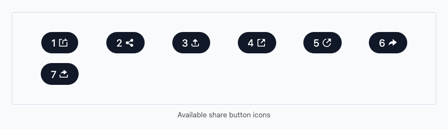
Icons
Change the share icon by setting the icon attribute to a number from 1 to 7.
Dark Mode
Out of the box, the share button supports dark mode and follows the user's OS preference. That means, when the OS is in dark mode, so will the button and vice versa.
Disable this behavior by setting the dark-mode attribute to false. Alternatively, specify your own dark mode styles by setting the dark-mode attribute to a list of CSS variables equal to the dark mode colors. These variables have identical names as the attributes.
<share-button dark-mode="--color-button: #00C0E8; --color-button-text: #FFF;"></share-button>Remember that the above example will only be visible when dark mode is set at the OS level. You can force this behavior in dev tools.
Time to Share
The share-button component makes it easy to share posts without that much effort from you or your readers. That's the point: share without the bear. Try it out and let me know what you think in the comments below.