Security and Privacy
Your principal concern should always be the security of your website and your users.
🔒 HTTPS: No Longer Optional
HTTP (Hyper Text Transfer Protocol) is the protocol for requesting and sending data between a client and a server. The "S" in HTTPS stands for "secure." It means that the data being transferred is encrypted by SSL/TLS.
An old way of thinking has it that a website only needs HTTPS if it deals with sensitive data like credit card numbers or user info. This is no longer true. Not having HTTPS can expose user data to malicious agents who can use it to identify them. Not using HTTPS also allows for less reputable network providers and third parties to inject ads into your site. Finally, lacking HTTPS may mean that your site will not be able to take advantage of PWA technologies.
These technical reasons are surpassed by the fact that visitors will perceive your site as less secure if it lacks the happy (sometimes green) padlock in the address bar. Fortunately, you can often deploy HTTPS for free, depending on your host or platform. LetsEncrypt offers free SSL certificates, and Certbot offers scripts to renew your certificate.
WordPress: Lock It Down
There are a host of things you need to do if you're on WordPress. Because the platform powers ~34% of websites, it's the most frequent target for attacks. At the most basic level, you need to keep WordPress and your plugins up to date, as outdated installations and plugins are often exploited. If a plugin is deprecated, you need to delete it and find a replacement. Security plugins like WordFence will alert you of plugins that need to be updated, as well as handle other aspects of securing your site.
Back Ups
Ensure you have a regular and reliable backup solution in place. If you're hacked or "ransomwared" or suffer some kind of calamity, will you be able to recover your data? I use the UpdraftPlus plugin on WordPress, which automatically back ups site content to cloud storage.
GDPR: Data Privacy and Security
The General Data Protection Regulation (GDPR) went into effect in May 2018. It's a regulation to protect personal data, obviously, which affects any website that has users from the EU. That means that an EU user who lives in the US is still protected by these regulations.
The data that the regulation aims to protect is defined as any "information that relates to an identifiable, living individual." It's anything that can be used to identify someone (email, name, dob, etc.). Sensitive personal data like race, political opinions, religious beliefs, etc. have even stricter protections.
The spirit of GDPR is the following. The regulation wants websites to review why they're collecting data, what they're doing with it, and consider whether it's necessary to collect the data in the first place. If so, GDPR states that websites must gain explicit consent from their visitors. This consent should be granular, rather than general. For example, websites need to gain consent for the use of an email address if it will be used for different purposes (website general use vs. marketing). Websites need to allow users to download and delete their data, they must notify users of breeches within 72 hours, and they need to have a privacy policy in place.
Another place where GDPR is frequently encountered is in a website's use of cookies. You've likely encountered the supremely annoying (in my opinion) popups that inform you that the website uses cookies. Cookies, by themselves, aren't harmful. They're files used to store data on your local machine (they can be used, e.g., to store your preferences on a site). Cookies, however, can also be used to track you as browse the web, identifying you even if you don't offer your identity. Because of this, GDPR compliance requires to gain consent for a site to set cookies. One frequent use of cookies is analytics. Google Analytics is often used because it's free and powerful; however, it also gives Google information about all of your visitors. Alternative analytics services have emerged (Fathom and Simple Analytics are linked below), which offer privacy-forward analytics.
There is far more to the GDPR, its unintended consequences, and additional guidelines for implementation. See the articles and resources below.
Recommended Reading
- Why HTTPS matters
- Everything you need to know about GDPR...
- How GDPR Will Change the Way You Develop
- How To Protect Your Users With The Privacy By Design Framework
- GDPR After One Year: Costs and Unintended Consequences
Resources
- How HTTPS works
- LetsEncrypt
- CertBot
- UpdraftPlus (WP Backup)
- Guide to WP Security
- Cookiebot: Generate a GDPR compliant cookie policy
- GDPR Enforcement Tracker
- Ship Your Enemies GDPR
- Simple and Fathom (privacy-forward analytics)
Accessibility (A11y)
The power of the Web is in its universality. Access by everyone regardless of disability is an essential aspect. -Tim Berners-Lee
You post your latest story, wanting to share your Einstein-themed pancake recipe with the world, replete with an excessively long backstory about how you're vaguely related to him and you have a goldendoodle named Albert, when you exclude a portion of you readership because your site isn't accessible.
It's unfortunately common. We do often fail to make the web accessible, especially when the web can be made accessible with only a little bit more knowledge and effort. It's also a win-win situation. By making your website accessible, you make your content available to the largest possible audience. You will also likely enjoy other benefits as well, like better code, better parsing by bots, and better SEO.
Microsoft, of all places, offers an insight about disability. It isn't a personal health condition, but one of mismatched human interactions. Accessibility is about getting the machines to change, to accommodate the people using them.
These mismatches can be grouped under 7 different categories, which are not coextensive with disabilities IRL.
- Visual: blindness, vision impairment, color blindness, poor vision
- Mobile: inability to use hand(s), tremors, loss of muscle control, paralyzed
- Auditory: Deafness, hearing impairment
- Prone to seizure: Prone to epileptic seizures caused by flashing lights
- Cognitive: developmental, dyslexic
- Internet access: speed/quality of connection
- Hardware/software: access to software updates, new devices
The barriers listed above may be permanent or temporary. For instance, you could temporarily lose the use of your hand due to injury. Many of the items listed above are likely self-explanatory; however, numbers 6 and 7 might not be. For 6, I have in mind visitors who might not have access to broadband or 4G internet connections, i.e., fast internet connections, which could be users in more rural areas or in regions that do not have a robust internet infrastructure. 7 refers to users who cannot use the latest browsers, perhaps because of device or work limitations.
Supporting Slow Connections and Outdated Browsers
Remember dial up? Remember how painful loading a website was? You can ameliorate that pain by optimizing your site, which I'll discuss below in the Performance section. However, what I'll mention here is that you can simulate slow connections from the comfort of your own gigabit internet via the dev tools of your browser (Windows: Ctrl + Shift + I; Mac: ⌘ + ⌥ + I). You can test out your own site using 2G or DSL.
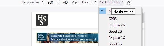
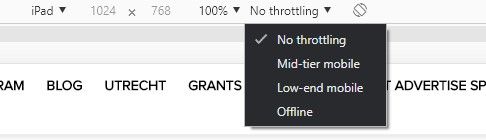
Throttling Options Available in Firefox (left) and Chrome (right) Dev Tools
When you're developing, you have to choose which browsers you want to want to support. The HTML, CSS, and JavaScript of today won't always work in the browsers of yesteryear. While it would be great to support all browsers all the time, it, ultimately, isn't worthwhile. You end up sacrificing user experience, including your own, for the sake of a small minority, who would likely end up getting a mediocre experience at best. It's a clear utilitarian argument.
Thankfully, developers offer a handful of tools so that you can have your cake and eat it, too. Basically, these tools automatically allow you to use the latest and greatest features while providing support for older browsers. These resources fall under the categories of polyfills, transpilers, and vendor prefixes.
Polyfills allow you to use new functions in code that don't exist in early iterations of the language. For example, filter() is a useful JavaScript function to filter an array. It was added as a feature in 2009. Therefore, if a browser doesn't support this version of JS, then your code won't work. A polyfill is a bit of code that you can add to enable the function in older browsers. Here's an example of a polyfill for the JS filter function.
if (!Array.prototype.filter) {
  Array.prototype.filter = function (func, thisArg) {
    "use strict";
    if (!((typeof func === "Function" || typeof func === "function") && this))
      throw new TypeError();

    var len = this.length >>> 0,
      res = new Array(len), // preallocate array
      t = this,
      c = 0,
      i = -1;
    if (thisArg === undefined) {
      while (++i !== len) {
        // checks to see if the key was set
        if (i in this) {
          if (func(t[i], i, t)) {
            res[c++] = t[i];
          }
        }
      }
    } else {
      while (++i !== len) {
        // checks to see if the key was set
        if (i in this) {
          if (func.call(thisArg, t[i], i, t)) {
            res[c++] = t[i];
          }
        }
      }
    }

    res.length = c; // shrink down array to proper size
    return res;
  };
}
Transpilers translate the coding language into different versions, like translating 18th-century English into the modern day vernacular. Here, the goal is not to polyfill or add in outdated functionality, but rather to allow you to use the newest syntax (which is often easier and neater) with older versions of the language, so the code will work across more platforms. The most popular transpiler available right now is Babel.


Finally, vendor prefixing allows you to bring CSS features to browsers that do not yet support them by adding, that's right, vendor prefixes (like -moz- for Firefox) to CSS properties. Before a feature is fully supported and released to the mainstream, browser vendors hide features behind prefixes while they test them. Developers can access these features by adding the prefixes to their code. As one might imagine, this use of prefixes goes against their intention. Consequently, many vendors are currently moving away from this practice.
/* Unprefixed Code */
.example {
  display: grid;
  transition: all 0.5s;
  user-select: none;
  background: linear-gradient(to bottom, white, black);
}

/* Vendor-Prefixed Code */
.example {
  display: -ms-grid;
  display: grid;
  -webkit-transition: all 0.5s;
  -o-transition: all 0.5s;
  transition: all 0.5s;
  -webkit-user-select: none;
  -moz-user-select: none;
  -ms-user-select: none;
  user-select: none;
  background: -webkit-gradient(
    linear,
    left top,
    left bottom,
    from(white),
    to(black)
  );
  background: -webkit-linear-gradient(top, white, black);
  background: -o-linear-gradient(top, white, black);
  background: linear-gradient(to bottom, white, black);
}
Supporting older browsers and users with less than ideal internet connections involves some forethought; however, the payoff will be a better experience for everyone, a leaner site, and more visitors!
Alt Tags
An alt tag provides a textual description as an alternative to an image, figure, or table, and it should always accompany these elements. If the image or graphical elements are essential to the content on the page, then the alt tag should provide the same information conveyed in the visual element. Since we take in an image at a glance, the alt text should mimic this experience as much as possible. What does that mean? Be concise. Convey the essential information and nothing more. You don't need to say, "An image of...," "A table of...," as screen readers will announce this information to visitors.
The <title> and <caption> tags should not be used as replacements for the alt tag, as they are not reliably read by screen readers. If an element is decorative, it should include an empty alt tag (alt=""). If this isn't present, the screen reader will read the image's filename, which is likely not desired. A better solution is often to load the image as a background image or decorative element via CSS. If you're using an icon, like a hamburger menu, it's advised to include text next to the item.
In addition to all the ways you should use alt tags, there are also times when you shouldn't use them. If images are repeated, one after the other, like in a list of user profile pics, you can use an empty alt tag. The alt tag shouldn't be used to credit the photographer or to bump up keywords.
<img src="/tree-of-life.jpg" alt="Darwin's tree of life" />
How a Screen Reader User Surfs the Web
Semantic Markup
In my research on accessibility, the single best thing that you can do to make your website (and even more widely, your digital presence) accessible is to use semantic markup. An added benefit is that it allows your content to be parsed, scraped, shared, indexed, and modified more easily. But what does having semantic markup mean?
In its strict sense, it refers to using the proper HTML tags on your web page. This principle, however, extends to anywhere you might create digital content, including texts in a word processor like Word.
An HTML tag directs a web browser how an element (part of a web page) should be displayed. Common tags include the paragraph <p>, hyperlink <a>, and unordered list <ul>. An important place to begin using these tags correctly is with header tags, identified in HTML as <h1>...<h6>. Header tags define the levels of your content. H1 should designate your page's title and the remaining tags should denote subsequent major sections of the page. In other words, these tags are not just presentational, but rather they have meaning, especially insofar as they help screen readers navigate your page.
<h1>History of Evolution</h1>

	<h2>History of Evolution before Darwin</h2>

		<h3>Erasmus Darwin</h3>

		<h3>Lamarck</h3>

	<h2>Darwin and Evolution</h2>

		<h3><em>Origin of Species</em></h3>

			<h4>The Concept of Natural Selection</h4>

	<h2>The Modern Synthesis</h2>
Even when you're not writing HTML, this principle carries over to most other digital domains. Headings in Microsoft Word or other word processors should be treated the same way. They aren't just for the way content is presented (which can be modified however you want), but defines its structure. In most word processors, using semantic headings also has the benefit of adding an automatic, real-time navigational structure to your document and allowing you easily to generate a table of contents.
But heading tags are only the tip of the iceberg. With the introduction of HTML5 in 2014, a whole host of new tags were introduced. Using these tags correctly will improve your site's accessibility greatly.
<article>Defines independent, self-contained content</article>

<aside>Content aside from the main content (e.g., sidebar)</aside>

<figcaption>Caption an image or graphic element</figcaption>

<figure>Container for the image and figcaption</figure>

<footer>Defines a footer for the page or section</footer>

<header>Defines a header for the page or section</header>

<main>Defines the main content of a page</main>

<nav>Defines a site's navigation links</nav>

<section>Defines a section of a page</section>
See the Pen Mock up page layout v2 (sections article) by Adrian Roselli (@aardrian) on CodePen.
ARIA
ARIA stands for Accessible Rich Internet Applications. They are attributes (prefixed by aria- ) that can be used on HTML tags to increase the accessibility of elements on a web page. Whenever possible, it is preferable to use semantic HTML5 tags instead of ARIA.
!-- An icon is not accessible to screen readers. aria-label provides this info.
The better approach is to add text to the icon -> ☰ Menu -->
<button aria-label="menu" class="hamburger">☰</button>

!-- Inherits a name from another element ID tag. Again, use HTML5 attributes
<label>
  whenever possible -->
  <div id="myBillingId">Billing</div>

  <div>
    <div id="myNameId">Name</div>
    <input type="text" aria-labelledby="myBillingId myNameId" />
  </div>
  <div>
    <div id="myAddressId">Address</div>
    <input type="text" aria-labelledby="myBillingId myAddressId" />
  </div>

  !-- Hide elements from screen readers -->
  <i class="fa fa-address-book" aria-hidden="true"></i>

  !-- Designate a region that is dynamically updated. Use the politeness setting
  to tune how frequently the screen reader announces updated. "Polite" informs
  the user when updates occur, but tries not to be annoying. "Off" turns off
  updates. "Assertive" interrupts whatever the user is doing to let them know.
  -->
  <div id="stock-prices" aria-live="polite"></div>

  !-- Let screen readers know whether sections of the page are expanded or not.
  Helpful in the case of accordions. -->
  <div aria-expanded="true">Expanded section</div></label
>
Transcripts & Captions
This is a simple one, but it can be time-consuming or expensive to implement. All video you post should include captions and a transcript. Captions refer to the text that appears below spoken dialogue in video; transcription refers to text of all the video's dialogue. All audio content should also include transcripts. Many popular video hosts offer tools to help you add captions to your videos. I've worked extensively with YouTube's caption tools, and they are easy and quick to use. Unfortunately, it does take a long time and can be tedious. Automation tools can help, but they are not good enough to produce accurate transcripts or captions.
There are multiple services available online that will caption/transcribe your content for you. They generally charge about $1.00/min; however, you can find cheaper options on sites like fiverr.
Because of the cost of captioning (time or money), you should factor it in when budgeting for projects. This might seem obvious, but it's easy to forget when writing a grant or planning a project.
Color Contrast
The color contrast criterion specifies that enough contrast should exist between text and the background so that users with moderately low vision or color blindness can still read the content. Tools are listed below to check whether you satisfy the criterion.
Skip to Content
For users who navigate a website by screen reader or keyboard, having to go though a long list of navigation items is tedious. To improve the experience for these users, developers can add a "Skip to main content" link to their page. This allows users to bypass the navigation links and get right to the page's content.
You can implement this technique by adding a button at the top of you page. For aesthetic reasons, you may wish to hide the button until a user brings it into focus.
<body>
  <a href="#maincontent">Skip to main content</a>
  <nav>...</nav>
  ... ... ...
  <div id="maincontent">...</div>
</body>
Recommended Reading
- Must Haves for Accessibility
- An Introduction to ARIA States
- Skip Navigation Links
- 🎙️ Accessibility (Syntax FM podcast)
- A11y with Lindsay (accessibility blog)
- How to Section Your HTML
- 🎙️ Accessibility is Social Justice (Presentable Podcast)
- An Introduction to WAI-ARIA Best Practices
- Inclusive Design
- Google's Guide to Accessibility
Resources
- Autoprefixer (Use task runners or plugins in projects)
- Babel (Transpiler)
- Polyfill.io
- Modernizr
- caniuse.com (Feature support for HTML/CSS)
- HTML5 Semantic Elements
- axe (accessibility testing app)
- Firefox and Chrome offer accessibility audits in browser
- WAI-ARIA Standard
- Accessibility Posters
- Accessible Color Generator
- Color Contrast Checker
- Skip Navigation Links
- Creating an Accessible Word Document
- Accessible accordion example
Performance
Performance refers to how quickly your site loads and how fast it feels. Research shows and experience confirms that no one wants to visit and spend time on a slow site. Generally, your site should have a load time of 3 seconds or less. If it's running, sluggish, there are several possible optimizations.
To find out which optimizations may benefit your site, you can use a variety of performance auditing tools (listed below) or use Lighthouse in the Chrome Dev Tools.
Images
Images usually occupy the greatest percentage of a web page's size. By serving compressed images at the right sizes, you can greatly reduce your page's loading times. For example, your website doesn't need to serve the same image on a 1200px viewport as on a 350px one. It would be overkill. Via your website's code, you can optimize your images, so that a smaller version is pushed to mobile viewports and a larger one to desktops. Many CMS's will implement this approach automatically or with the help of a plug-in (I use Smush Image Compression on WordPress). Nevertheless, it's useful to know some of the techniques behind the scenes.
- Use srcset and sizes (HTML)
- Lazy loading (newly native)
- Compress images and use new formats like WebP
!-- Define your set of sources -->
<img
  srcset="image-320w.jpg 320w, image-480w.jpg 480w, image-800w.jpg 800w"
  sizes="(max-width: 320px) 280px,
            (max-width: 480px) 440px,
            800px"
  src="image.jpg"
  alt="George Sarton hidden treasure"
/>
Minify Your Code
You can minify JS, CSS, and HTML. Minification reduces the size of these files by removing comments and unnecessary spaces. It can also add optimizations like shortening variable names and using other techniques.
/* Unminified CSS */
/* Button for Utrecht */
.utrecht-button,
.dryfta_bye_ticket a {
    display: block !important;
    margin: 15px auto 15px !important;
    padding: .5em .8em !important;
    width: 230px !important;
    width: -webkit-fit-content !important;
    width: -moz-fit-content !important;
    width: fit-content !important;

    background: #ffd657 !important;
    -webkit-box-shadow: 3px 3px 8px rgba(0, 0, 0, .25) !important;
    box-shadow: 3px 3px 8px rgba(0, 0, 0, .25) !important;
    color: #000 !important;
    font-weight: 900 !important;
    line-height: 1;
    text-align: center;
    text-decoration: none !important;
    text-transform: uppercase !important;
}

.utrecht-button:focus,
.utrecht-button:active,
.utrecht-button:visited,
.dryfta_bye_ticket a:focus,
.dryfta_bye_ticket a:active,
.dryfta_bye_ticket a:visited {
    -webkit-box-shadow: 2px 2px 5px rgba(0, 0, 0, .45) !important;
    box-shadow: 2px 2px 5px rgba(0, 0, 0, .45) !important;
    color: #000 !important;
    font-weight: 900 !important;
    text-decoration: none !important;
}

/* Minified */
.dryfta_bye_ticket a,.utrecht-button{display:block!important;margin:15px auto 15px!important;padding:.5em .8em!important;width:230px!important;width:-webkit-fit-content!important;width:-moz-fit-content!important;width:fit-content!important;background:#ffd657!important;-webkit-box-shadow:3px 3px 8px rgba(0,0,0,.25)!important;box-shadow:3px 3px 8px rgba(0,0,0,.25)!important;color:#000!important;font-weight:900!important;line-height:1;text-align:center;text-decoration:none!important;text-transform:uppercase!important}.dryfta_bye_ticket a:active,.dryfta_bye_ticket a:focus,.dryfta_bye_ticket a:visited,.utrecht-button:active,.utrecht-button:focus,.utrecht-button:visited{-webkit-box-shadow:2px 2px 5px rgba(0,0,0,.45)!important;box-shadow:2px 2px 5px rgba(0,0,0,.45)!important;color:#000!important;font-weight:900!important;text-decoration:none!important}
Upgrade Your Hosting Solution
Upgrading your hosting solution may greatly benefit your site's speed. Shared hosting can be prey to the nosy neighbor problem, which is when other sites on the server hog resources because of hacks, surges in use, bugs, or for other reasons. By having your own server or virtual private server (VPS), you can ensure resources are allocated exclusively for your site.
Use a Content Delivery Network (CDN)
Where is your server located? The location of the server, or more precisely, its distance from the user, can affect the speed of your server. If your server is located in NYC and your user is in China, then a connect needs to be made between the two locales. Imagine, however, if you had a server in NYC, Tokyo, Brisbane, San Francisco, Berlin, etc., then you could reduce the distance your user has to "travel." This is made possible by the use of a content delivery network (CDN), which duplicates your website across different servers all over the world. Some server hosts offer this service for free, or you can purchase it as a service from several other companies.
Recommended Reading
Resources
- GTMetrix
- Pingdom
- Google PageSpeed Insights
- In Chrome: Lighthouse
- Smush Image Compression (WordPress Plugin)
- Responsive Images
Digital Design
User experience (UX) and user interface (UI) design have many nuanced definitions, often contested. Have you ever visited a website only to give up on it out of frustration? That's bad UX/UI. In short, they both involve philosophies regarding how to ensure your users have the most enjoyable experience possible. Rather than discussing the finer points of these definitions, I will share some of my recommendations for sites that are content, and especially text, heavy.
Key Philosophies
Responsive Design
This philosophy of design strives to ensure websites function well on all viewports. If a user visits your website on their desktop, tablet, or smartphone, they should receive an equally enjoyable experience.
Responsive Design Techniques
- CSS @media rules
- CSS relative units (e.g., vh, vw, em, rem, %)
- CSS flexbox
- CSS grid
Graceful Degradation/Progressive Enhancement
These related philosophies are approaches to development that provide the best possible experience for users, agnostic of a user's hardware. In the case of graceful degradation, developers provide a fallback for users who cannot support the website's latest features. Often times, this fallback offers an inferior experience.
Progressive enhancement, by contrast, provides a baseline experience for all users with added features for those with supported browsers. It is a more bottom-up approach, and now the favored one by developers.
That being said, these two philosophies can often complement in each other in practice.
Typography
The web page is not the printed page. Approximating the printed page often leads to poor design. The economics of print publishing influences how text appears on the page, but those economics don't apply on the web. We don't need to maximize words on the page or reduce page counts. We can jettison narrow margins and control the display of text.
This means that we can have font sizes that are large enough to read on digital devices, luxuriously large margins, and typefaces that make us swoon. Practically, this boils down to a few recommendations.
Your font size is (maybe) too small. Word processors like Word have accustomed us to setting our font size to 12 pt, which is quite different from 12 px. 12 pt, in fact, is equal to 16 px. It's helpful to remember that we sit farther away from our computer monitors that we sit from a book. Font size should reflect that. For most applications, font size should be 16 px to 26 px, and almost never lower than the minimum.
 Ryan Feigenbaum
Another pitfall in typography is line height or leading. As the name implies, line height is the distance between lines of text. The mistake is often making this property too small. The recommended line height is 120% to 160% of font size. This means that if your font size is 16 px, a line height of 150% is equal to 22.5 px between lines.
The third consideration is line length, that is, how many characters there are per line. Studies show that too many or too few characters per line impede the ability to read content quickly, which often makes users abandon your content. The recommended line length–which you can modify by changing width, padding, margin, or other elements–is 45 to 90 characters (including spaces).
It's also good to remember that attention spans are ever dwindling: people scan, they don't read; and that the semantic headings discussion above applies here. These considerations mean that walls of text on a web page are always a mistake. Content should be sectioned into digestible chunks that can be taken in at a glance. Semantic headings, discussed above, should be used to organize this content.
Walls of text on a web page are always a mistake.
These guidelines, taken together with other basics, like limiting your number of fonts to fewer than two, choosing fonts that complement one another, using font weights strategically, left justifying paragraphs, avoiding all caps when possible, etc., will make your site much more engaging for visitors, who will want to keep reading your content.
Recommended Reading
- The 15 Rules Every UX Designer Should Know
- We Have Lost Track of What UX Actually Means
- What is User Experience?
- The Difference between UX and UI Design: A Layman's Guide
- The Difference between UX and UI: How to Hire and Find the Right Designer
- 🎙️ UX Considerations (HTML All the Things podcast)
- Web Fonts
- Responsive Font Sizes
- Scale Typography for Any Screen
- Best UX Practices for Line Spacing
- Getting Typography Right in Digital Design
- Reader Mode: The Button to Beat
- Getting Digital Typography Right
Resources
- User Inyerface (Most poorly designed website of all time)
- Buterick's Practical Typography
- Golden Ratio Typography Calculator
- Gridlover (Typography Calculator)
- Google Fonts