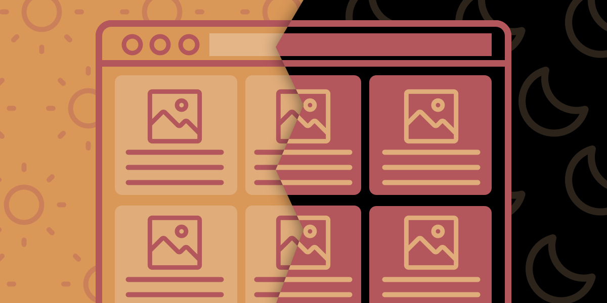
You may have noticed that Dark Mode is becoming more and more a thing. In this article, I provide a complete guide to adding Dark Mode to your website.
Best Practices to Unlock the Dark Side
Recently, Chris Coyier at CSS-Tricks threw down the gauntlet for anyone who was about "to write a blog post about dark mode." He listed 10 points that would need to be covered:
- Explain Dark Mode
- Provide a demo (Jump to the demo)
- Explain that Dark Mode can happen at the operating system level itself
- Show how JavaScript can know about the OS-level choice
- Let the user have ultimate say over color preference
- Build a theme switcher, including gotchas
- See who else is building Dark Mode toggles
- See who else is writing about it
- Discuss what is and isn't supported
- Make accessibility a main concern
This post aims to cover all 10 points (some better than others). I offer what I've found to be the best practices for implementing a dark mode toggle, and I look forward to refining these practices with suggestions, criticisms, and comments from the community.
The Order of Operations
- UI/UX Considerations
- Defining a Dark/Light UI with CSS Custom Properties
- Toggling between Dark/Light Mode with JavaScript
- Respecting the OS-Level Color-Scheme Preference (and Letting the User Override That Preference)
UI/UX Considerations
Definitions
- Dark Mode
- A UI that generally uses a darker color palette
- Light Mode
- A long-standing but not immemorial default, in which a UI uses a lighter color palette.
Despite the vociferous support of some, Dark Mode is not held to be superior by all. The preference for either mode is subjective. A user might even prefer to use different modes at different times of day or depending on their location. Perhaps you're browsing Reddit in bed beside your trying-to-sleep spouse who complains about the light from your 32-inch laptop. You just switch modes and, oh my Zsh, Dark Mode saves a marriage, again.
Accessibility
Switching between a dark color palette and a light one involves more than just switching between darker and lighter background colors. Most importantly, you need to ensure that colors on both palettes meet contrast requirements for accessibility. Many colors will not be interchangeable between modes. This means that you may need different primary or brand colors for each palette.
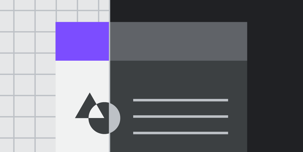
A second consideration is visual hierarchy. Based on Chethan KVS's excellent article on designing a dark theme, which is itself based on the principles of Material Design, the gist is that darker shades should be reserved for surfaces at the back of the page, with lighter and lighter shades used as you approach the front. For example, to indicate that a modal sits on top of the page, its background color should be lighter than the background color of the section behind it.
Given these guidelines, I've found the following strategy useful for constructing dark and light color palettes.
Surface Colors
Begin with your surface colors, which might include three or more shades that increase in lightness. These will be the background color of your site's body, menus, footers, navigation bars, modals, etc.
Element Colors
Do the same thing with your element colors, which might include three or more shades that increase in darkness. Element color refers to things like font color, horizontal lines, borders, tables, and anything else that needs to stand apart from the background. The trick here is to ensure that combinations of background and text meet contrast requirements where appropriate.
Signature Colors
Finally, choose your sets of primary, secondary, etc., colors. Again, ensure that these colors maintain sufficient contrast on all background colors if they're going to be used as a font color.


Example Dark and Light Color Palettes
Defining a Dark/Light UI with CSS Custom Properties
Nice. You now have some beautiful dark and light color palettes. You're probably thinking to yourself, "I better start preparing my acceptance speech for my palette of the year award." If you're not yet at peak color palette, there are tons of generators out there. Three that I'm particularly fond of include Tailwind's shade generator, the material design palette generator, and ColorSpace's palette and gradient generator.
All dressed up and nowhere to go
But what do you do now? How do you get your palettes to work on your website?
Enter CSS custom properties, which allow you to define variables in CSS. By using the same property name for your dark and light color palettes, you and your users can toggle between color modes.
Since a custom property is limited to the selector in which it's defined, best practice dictates generally defining all properties under the pseudo-selector :root so that variables are available globally. To differentiate between whether the light or dark palette is active, use a color-mode custom attribute selector, which we can target with JavaScript.
/* Define dark and light palettes with CSS variables */

/* Light Mode */
:root[color-mode="light"] {
  --surface1: #e6e6e6;
  --surface2: #f2f2f2;
  --surface3: #ffffff;
  --element1: #111111;
  --element2: #222222;
  --element3: #333333;
  --elementInverse: #eee;
  --primary: #01408e;
  --secondary: #3c5d5c;
  --tertiary: #fff7d6;
}

/* Dark Mode */
:root[color-mode="dark"] {
  --surface1: #262626;
  --surface2: #333333;
  --surface3: #404040;
  --element1: #eeeeee;
  --element2: #dddddd;
  --element3: #cccccc;
  --elementInverse: #111;
  --primary: #8fceff;
  --secondary: #72faca;
  --tertiary: #eee8a9;
}
Toggling Dark/Light Mode with JS
Palettes are defined. They're in the stylesheet. But nothing's happening yet!
Define Your Default
We need to tell our document which mode it should be in by writing a custom attribute on the html tag. We're going to write a function that allows users to toggle between dark and light mode, but you first need to define a default mode for the site. Should it load in dark or light mode? This choice will be up to you and maybe some user research. The markup below shows us how to set a default color mode.
<!--- Default to light mode --->
<html color-mode="light">
  ...
</html>

<!--- Default to dark mode --->
<html color-mode="dark">
  ...
</html>
Create a Color Mode Toggle Button
For the user to toggle between modes, they'll need something to click. There are several clever implementations, which include cool animations between states or custom icons. For this article, I'll do something more pedestrian and alternate between two icons, a sun and moon, to represent light and dark mode, respectively. (SVG icons are referenced here with the use method.)
<!--- Light mode button --->
<button class="color-mode__btn light--hidden" aria-label="Toggle light mode">
  Toggle Light Mode
  <svg aria-hidden="true">
    <use href="#sun"></use>
  </svg>
</button>

<!--- Dark mode button --->
<button class="color-mode__btn dark--hidden" aria-label="Toggle dark mode">
  Toggle Dark Mode
  <svg aria-hidden="true">
    <use href="#moon"></use>
  </svg>
</button>
To show and hide the buttons depending on the current site's state, we can combine the element's class of "dark" or "light" with the site's current state as defined by the "color-mode" HTML custom attribute.
/* Any element with the class "light--hidden" will be hidden when the site is set to Light Mode */
:root[color-mode="light"] .light--hidden {
  display: none;
}

/* Any element with the class "dark--hidden" will be hidden when the site is set to Dark Mode */
:root[color-mode="dark"] .dark--hidden {
  display: none;
}
We are on fire 🔥. We've got our HTML and CSS in place, our default color mode displays, so now it's time to hook up our JavaScript to make our buttons interactive. There are three pieces to the code.
- Define a function to toggle between dark and light modes
- Create an event handler that listens for clicks on our sun and moon buttons
- Select those buttons in the DOM
The color mode toggle code works as follows. When a user clicks the button, the toggleColorMode function looks to see whether the button contains the class "light--hidden." If it does, then it sets the document's color-mode attribute to "light," thereby turning on Light Mode. If not, then it turns on Dark Mode. But that's not all. The function also sets an item in the user's local storage, which sets the selected mode as the user's preference. You can check it out by visiting the Local Storage option in the Storage or Application panel in your browser's developer tools. Since local storage persists almost indefinitely, the user's preference for light or dark mode remains for any return visit the user may make, even after exiting the browser.
const toggleColorMode = (e) => {
  // Switch to Light Mode
  if (e.currentTarget.classList.contains("light--hidden")) {
    // Sets the custom HTML attribute
    document.documentElement.setAttribute("color-mode", "light");

    //Sets the user's preference in local storage
    localStorage.setItem("color-mode", "light");
    return;
  }

  /* Switch to Dark Mode
    Sets the custom HTML attribute */
  document.documentElement.setAttribute("color-mode", "dark");

  // Sets the user's preference in local storage
  localStorage.setItem("color-mode", "dark");
};

// Get the buttons in the DOM
const toggleColorButtons = document.querySelectorAll(".color-mode__btn");

// Set up event listeners
toggleColorButtons.forEach((btn) => {
  btn.addEventListener("click", toggleColorMode);
});
Respecting User Color-Scheme Preference
Look at how far we've come! We've defined a dark and light color palette that users can toggle between, and our site will even remember a user's last preference.
But preferences can be set at another level altogether, that is, in the operating system itself. You can set your color preference in Windows, MacOS, and Android, with varying levels of support. If a user has gone to the trouble of changing this preference, then it would be great if we could render our site according to that preference on initial load, automatically.
With the CSS media feature, prefers-color-scheme, accessible via JS and CSS, we can. Here's what the code should do. If the user has set an OS-level preference for a color scheme and has not set a preference on our site during an earlier visit, then we should respect the OS-level preference and render the site accordingly in light or dark mode. If a site-level preference was set, then we should respect that preference, instead of the OS-level preference. To ensure that this code executes before rendering the page, put it in the <head> tag of your page.
// This code assumes a Light Mode default
if (
  /* This condition checks whether the user has set a site preference for dark mode OR a OS-level preference for Dark Mode AND no site preference */
  localStorage.getItem("color-mode") === "dark" ||
  (window.matchMedia("(prefers-color-scheme: dark)").matches &&
    !localStorage.getItem("color-mode"))
) {
  // if true, set the site to Dark Mode
  document.documentElement.setAttribute("color-mode", "dark");
}
Demo 🎉
The only thing left is to see it all in action. All the source code for the demo is also available.
A Note on Support
CSS Custom Properties
CSS Custom Properties or Variables are supported in 94.68% of browsers. Support is lacking in IE and older browsers. It's easy to supply a fallback in these cases; however, users won't be able to switch between color modes in an unsupported browser, which will be set to whatever you set as the default.
/* Provide a fallback in cases where custom property does not load or is not supported */
body {
  background-color: #e6e6e6;
  background-color: var(--surface1, #e6e6e6);
}
Use a SASS Mixin to Automate Your Fallback
Writing the additional fallbacks is tedious. You can automate the process by using a SASS mixin, which will write the fallbacks for you.
/* Define your color map */
$colors: (
  "surface1": #e6e6e6,
  "surface2": #f2f2f2,
  "surface3": #ffffff,
  "element1": #111111,
  "element2": #222222,
  "element3": #333333,
  "elementInverse": #eee,
  "primary": #01408e,
  "secondary": #3c5d5c,
  "tertiary": #fff7d6
);

/* Define your mixin */
@mixin color-var($property, $color) {
  #{$property}: map-get($colors, "#{$color}");
  #{$property}: var(--#{$color}, map-get($colors, "#{$color}"));
}

/* Include your mixin */
html {
	@include color-var(background-color, surface1);
}

/* In CSS, the mixin renders as follows */
html {
	background-color: #e6e6e6;
    background-color: var(--surface1, #e6e6e6);
}
Prefers-Color-Scheme
The prefers-color-scheme media query is supported in 80.85% of browsers. Lack of support should not break anything.
One strategy we can take for those browsers that don't support this feature is to hide the toggle button. To do this, we test to see whether custom properties are supported. If not, we hide the toggle buttons. You can test this out by opening up the demo in IE. It'll default to the light color theme and hide the toggle buttons, since they wouldn't be operative. The updated code is below.
// Get the buttons in the DOM
const toggleColorBtns = document.querySelectorAll(".sm-color-mode-btn");

if (window.CSS && CSS.supports("color", "var(--primary)")) {
  const toggleColorMode = (e) => {
    // Switch to Light Mode
    if (e.currentTarget.classList.contains("light--hidden")) {
      // Sets the custom HTML attribute
      document.documentElement.setAttribute("color-mode", "light");

      // Sets the user's preference in local storage
      localStorage.setItem("pref", "light");
      return;
    }
    /* Swtich to Dark Mode
      Sets the custom HTML attribute */
    document.documentElement.setAttribute("color-mode", "dark");

    // Sets the user's preference in local storage
    localStorage.setItem("pref", "dark");
  };

  // Set up event listeners
  toggleColorBtns.forEach((btn) => {
    btn.addEventListener("click", toggleColorMode);
  });
} else {
  // If the feature isn't supported, then hide the toggle buttons
  toggleColorBtns.forEach((btn) => {
    btn.style.display = "none";
  });
}
👋 That's it, folks! Suggestions welcomed. Follow me on Twitter: @theroyalfig
Resources
 Chris Coyier
That crazy SOB did it
 Chethan KVS
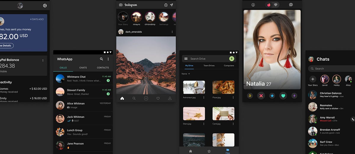
 Thomas Steiner
 Ananya Neogi