I just gave my website a little redesign with a new Ghost theme I created called Inline. Previously, I used a theme called Mel and Smart before that. All these themes are open source and available on GitHub. Smart, in particular, continues to be updated and can be used by anyone on their Ghost site.
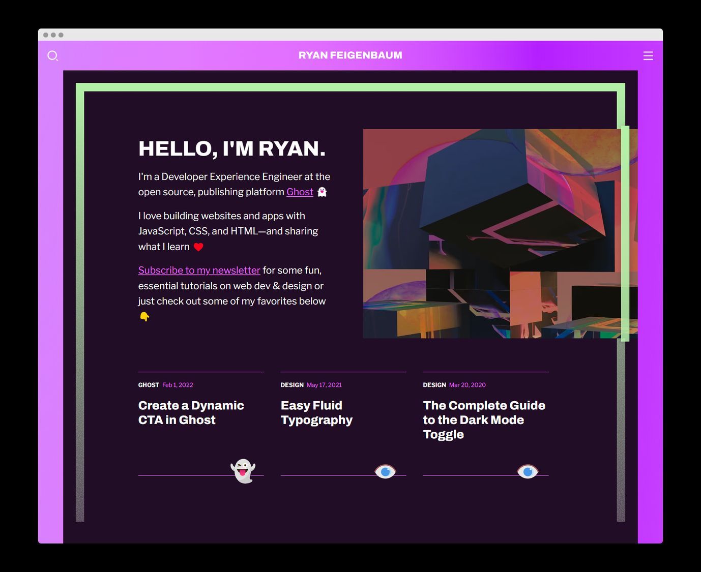
The sage advice is to stop mucking about with your theme and get to creating content. Luckily for me, creating themes is my content (checkmate, sage advice) and by the time you finish reading this, I'll probably be working on a redesign of the redesign.
Inspiration
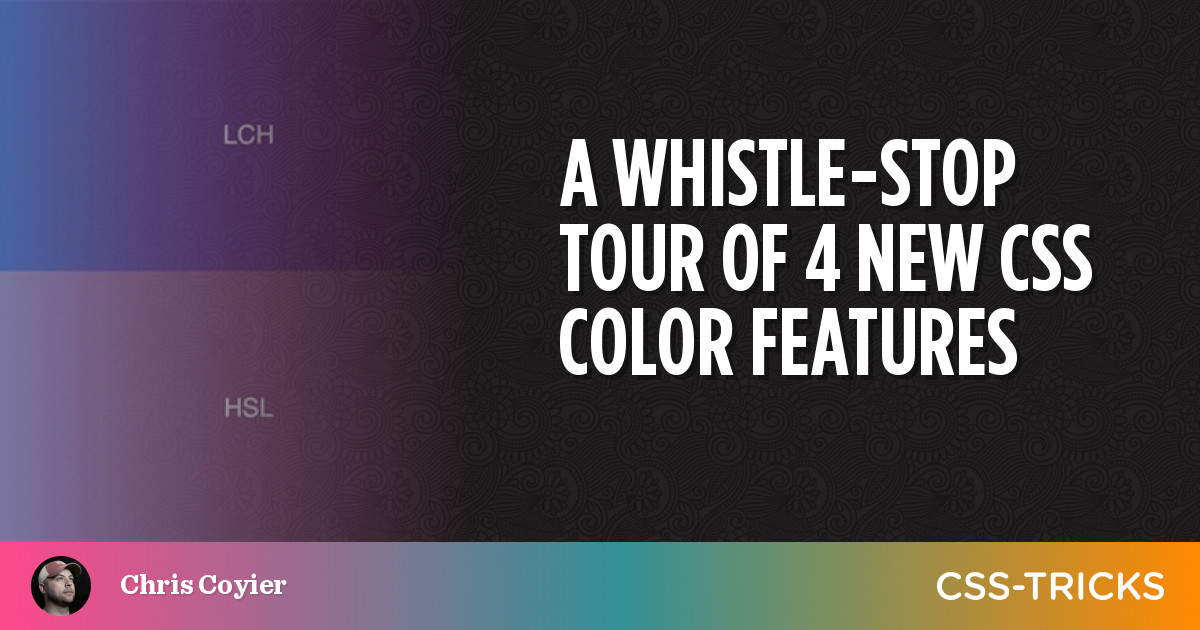
The theme's name, Inline, is an allusion to my inspiration for its design: The Outline. I love the publication and its design (obviously), and CSS Tricks recently featured it in an article on designing for long-form content.
Compared to my previous themes, I wanted a more expressive feel: loud colors, weirdness, and some neobrutalism. But I also wanted it to offer a minimal, ergonomic reading experience. So, I took what I call the reverse mullet method of web design: party in the front homepage, and business in the back content pages.

Highlights
When the site's your own, you basically have carte blanche to do whatever you want. So, like von Humboldt, I took the opportunity to do some self experiments. Here are some of my favorite results.
Dynamic color scheme
The entire site's color palette is automatically generated from a single chosen color. With Ghost, I use the accent color defined in the Admin. With it, I generate a complete color palette for both light and dark modes.
function generateColorPalette(e) {
    const hex = e?.target.value || document.documentElement.dataset.accentColor;

    const [h, s, l] = hexToHSL(hex);

    const complementary = h + 180 > 360 ? h - 180 : h + 180;
    document.documentElement.style.setProperty('--primary-h', h);
    document.documentElement.style.setProperty('--saturation', `${s}%`);
    document.documentElement.style.setProperty('--lightness', `${l}%`);
    document.documentElement.style.setProperty(
        '--complementary-h',
        complementary,
    );
}

generateColorPalette()
It works by transforming the hex color to HSL. Then, I use the CSS calc function to generate the other values by modifying hue, saturation, and lightness. In CSS, HSL is forgiving, so you don't need to worry about exceeding the hue threshold of 360 degrees. For example, 365 degrees will be converted automatically to a hue of five degrees.
A todo here is to test for color contrast and adjust colors accordingly. I'm also excited for some of the new CSS color functions coming down the pike.
CTRL/CMD + m. Click the color palette swatch and choose a new color. The site will instantly update to reflect the new palette. Don't like it? Just refresh to reset it.Full-text fuzzy search
I built a custom search interface to enable full-text search. It's based on the quick, well-optimized library minisearch.
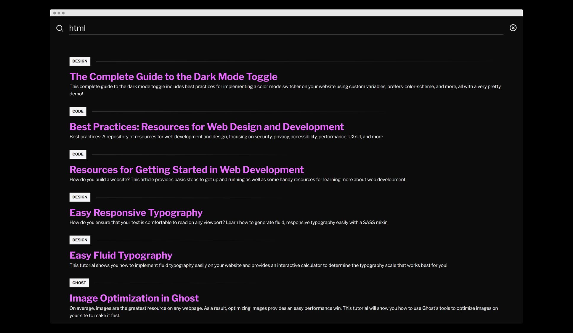
The line above the search result title indicates the relative strength of the result. Try it out by clicking the search icon or hitting CTRL/CMD + k.
There's very basic caching and the entire implementation is fewer than 100 lines of code.
Generative structure
The redesign forced me to reconsider the organization of my site. Despite best practices that recommend focusing on a niche, I have lots and lots of disparate interests. Rather than hiding those away, the redesign was an effort to bring them together, while still having a primary focus on web dev.
There are now four categories (each with three subcategories):
- Web Dev & Design (Code, Design, Ghost)
- Essays (Live, Laugh, Love)
- Things I've Made (Web, Art, IRL)
- Academic (Philosophy, Science, History)
Everything I write now needs to fit into one of these categories, which is actually liberating because I don't need to think about how to tag a post: the options are laid out and I just have to choose from them.
Additionally, and this is something I didn't expect, having these categories has helped to generate a ton of new ideas. For example, for the Things I've Made category, I immediately started thinking of all the projects—in my house, on the web, and in the kitchen—I could write about.
In short, it's no longer about coming up with brand new ideas, but just filling buckets. Maybe it's like a Hello Fresh approach to producing content: all the ingredients are provided, I just need to put them together. And, rather than staring at a blank page and being bullied by a blinking, demanding caret, I can fill out a template. It's, of course, not that easy, but I guess the proof will be whether I can hit that publish button more often, with better results. Time will tell.
Great development experience
Working on the theme also helped me to refine my own Ghost theme development tooling. (I have a Ghost theme starter if you're interested in taking it for a spin.)
Here are some of the benefits:
- CSS and JS compilation/transpilation via PostCSS and Rollup
- CSS and JS linting/formatting via Stylelint, Eslint, and Prettier
- Versioning and automatic deployment via GitHub Actions
- And, my favorite, a live reload server that automatically refreshes the page when a template, CSS, or JS file changes
For better or worse, the takeaway here is that for the current state of web dev, even a relatively simple project gets very complex very quickly 😅
Iteration
Inline is on its way. But what I've learned is that, like most things, that last 10% is the hardest. Iterating over your design, refining it — that's what often separates a good design from a great design.
These changes are rarely severe, but rather take place on a continuum, shifting values by degrees, not magnitudes.
It's hard to do, and I don't know if I've ever or will ever do it.
For me, the degrees always slip into magnitudes and refinement becomes a full-blown redesign.
