With the redesign of my theme, Smart, I combined Ghost's default pagination behavior with some JS to create a custom pagination element. (Go to the homepage to see it in action.)
In this article, I'll discuss how I built it, sharing the code that makes it work.
An Overview of Pagination in Ghost
Ghost automatically paginates every collection of posts, whether it's your latest posts, an author's posts, or the posts associated with a tag. If you had 100 posts, for example, and 20 posts per page, then Ghost would create 5 pages for each group of posts. (You define the number of posts per page in your theme's package.json file.)

The simplest way to get pagination is to use the provided {{pagination}} helper that outputs the following markup:
<nav class="pagination" role="navigation">
{{#if prev}}
<a class="newer-posts" href="{{page_url prev}}">← Newer Posts</a>
{{/if}}
<span class="page-number">Page {{page}} of {{pages}}</span>
{{#if next}}
<a class="older-posts" href="{{page_url next}}">Older Posts →</a>
{{/if}}
</nav>
It includes links to the previous and next pages as well as indicating the total number of pages. The pagination class is provided for custom styling.
Customizing the Pagination Helper
It's possible to customize this markup by creating a pagination.hbs file in the partials folder, which will overwrite Ghost's default element. That's the first step I took in creating my theme's custom pagination element. I replaced Ghost's markup with this:
{{#match pagination.pages ">" 1}}
<div class="sm-grid">
  <nav
    class="sm-pagination"
    data-pages="{{pages}}"
    data-page="{{page}}"
    data-prev="{{page_url prev}}"
    data-next="{{page_url next}}"
  ></nav>
</div>
{{else}}
<div class="sm-pagination-holder"></div>
{{/match}}
The first line of the helper—{{#match pagination.pages ">" 1}}—checks whether there is more than one page. If there is, then it shows the pagination element, but if not, then it shows a div with the sm-pagination-holder class. This (place)holder maintains consistent spacing whether the pagination element is rendered or not.
Where the magic happens is with the data attributes, which are used to share data from the pagination helper with my JavaScript pagination code. Here are the attributes:
data-pagescontains the total pages availabledata-pagecontains the current page of the collectiondata-prevcontains the URL of the collection's previous pagedata-nextcontains the URL of the collection's next page
Rendering the Pagination Helper with JavaScript
Adding this data with attributes makes it easily accessible via JavaScript. I'll share the code for the custom pagination element and then explain what it does.
export default function generatePagination() {
  const pagination = document.querySelector(".sm-pagination");

  if (!pagination) return;
  const pathname = pathnameParser(window.location.pathname);
  const { pages, page, prev, next } = pagination.dataset;

  navButtonFormatter(prev, "previous", pagination);

  for (let index = 0; index < pages; index += 1) {
    let urlPath;

    if (index === 0 && pathname === "/") {
      urlPath = "/";
    } else if (index === 0 && pathname !== "/") {
      urlPath = pathname;
    } else {
      urlPath = `${pathname}page/${index + 1}/`;
    }

    const div = document.createElement("div");
    div.classList.add("sm-pagination-item");
    const a = document.createElement("a");
    a.setAttribute("href", urlPath);
    a.textContent = index + 1;

    if (+page === index + 1) {
      div.classList.add("sm-current");
    }
    div.append(a);
    pagination.append(div);
  }

  navButtonFormatter(next, "next", pagination);
}
After the page loads, the generatePagination function runs. It first selects the .sm-pagination element. If that element doesn't exist (when the match helper from above return false), then the function stops executing: if (!pagination) return.
const pathname = pathnameParser(window.location.pathname);
I parse the current URL to help build the correct URLs for the various paginated routes.
const { pages, page, prev, next } = pagination.dataset;
Next, we get to see the custom pagination markup in action. From the pagination element, I destructure the data attributes into their respective values. Here's an example of what those values look like:
{
  next: "/page/2/",
  page: "1",
  pages: "3",
  prev: ""
}
From there, I run a function (navButtonFormatter) to create a previous page button—I use the same function to create a next page button.
function navButtonFormatter(nextOrPrevEl, nextOrPrevName, paginationEl) {
  const icon = nextOrPrevName === "previous" ? "left" : "right";
  const className = nextOrPrevName === "previous" ? "sm-prev" : "sm-next";

  const navButton = nextOrPrevEl
    ? document.createElement("a")
    : document.createElement("span");
  navButton.innerHTML = `<svg aria-hidden="true"><use href="#sm-${icon}-arrow-icon"></use></svg>`;
  navButton.classList.add("sm-circle-icon-button", className);

  if (nextOrPrevEl) {
    navButton.setAttribute("aria-label", `${nextOrPrevName} posts`);
    navButton.setAttribute("href", nextOrPrevEl);
  } else {
    navButton.classList.add("sm-circle-icon-button", "sm-nav-disabled");
  }

  paginationEl.append(navButton);
}
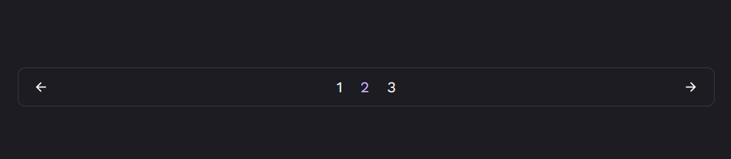
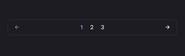
These buttons are the back and forward icons flanking the numbers in the pagination element. The function outputs different markup depending on whether a previous page exists or not.
In the image, there's no previous page, so the icon's opacity is lower and the icon doesn't change when hovered. While you could hide the icon altogether, this disrupted the symmetry of the design in testing.
The final part of the code creates linkable page numbers and adds a class to highlight the current page.
In broad strokes, that's how to build a custom pagination element in Ghost. There are, of course, a hundred different ways to build this. If you have a different method, let me know in the comments 💬
The full source code is available as is the theme:
 royalfig

A Limitation of this Code
At the moment, there's a limitation to this code. I'm planning to address it soon, but I'm keen to know whether you can figure out what it is. If you know, share it in the comments below 👇