For theme developers, custom settings are cool as shit. Before, if you wanted to give users customization options, it usually required them to edit Handlebars files, inject JS or CSS, or some unholy mixture of the two. Now, you can empower a user to customize their theme easily without having them touch a line of code.
 TryGhost
That's one small commit for Ghost, one giant leap for Ghost theme developers. 😂

What type of customization are we talking about?
The only limit is your imagination, really, but you can solve some common pain points for users right out of the gate.
- Are you going for a more classy, subdued look or do you want the ecstatic irreverence of Lisa Frank? It's your choice–all from the comfort of a color-palette dropdown.
- Do you not know better and want to enable comments on your site? Enter a bit of info and now you can hear random people's thoughts.
- Want to get those follows? Easily add your socials to the navbar.
- Not interested in Ghost's member functionality? Toggle it on, toggle it off.
- Want this a little bigger or that a little smaller? Customized layouts are only a few clicks away.
- And more...
OK, now I want to do it. Tell me how
Implementing custom settings requires two things:
- An entry in the theme's
package.jsonfile - Reference to the setting in the theme file
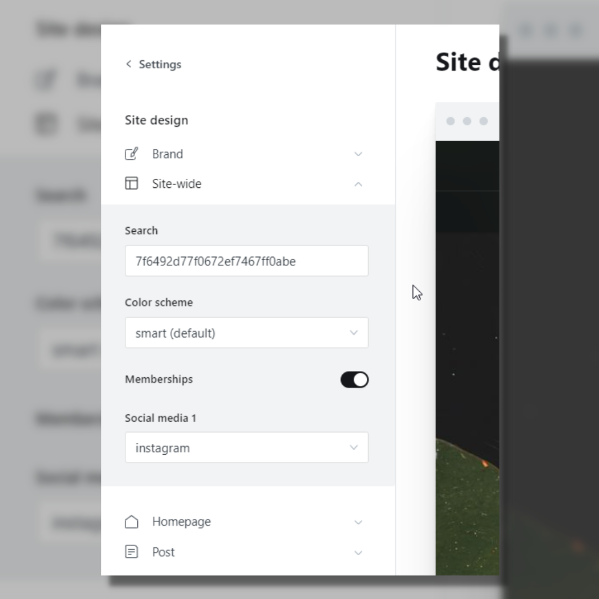
Once these are in place, the user can make their customizations via the Design menu in the Ghost Admin.
To begin, add a custom key to the config object in your package.json file.
{
 "config": {
    "posts_per_page": 10,
    "image_sizes": {

    },
    "custom": {

    }
  }
}
Custom settings in package.json
Within the custom object, you can then define the name of your custom setting. Names must be in snake_case with lowercase letters. Underscores (_) are replaced by spaces in the UI.
For each setting, you can specify one of five types and where appropriate a default value.
- select: choose from a list of predefined items
- boolean: true or false
- color: choose a color via a color picker
- image: upload an image
- text: enter an arbitrary bit of text
In addition to custom setting types, you can also specify a group. By default, custom settings will appear in the site-wide group. If the setting affects the entire site, like defining a color scheme, then this default works. However, you can also assign custom settings to only appear in the post or homepage toggle menus. A post setting might be the ability to switch on syntax highlighting, whereas a homepage setting might be the ability to specify the hero image's size.
When you put this all together, your entry in your package.json looks like this:
{
    "config": {
        "custom": {
            "color_scheme": {
                "type": "select",
                "options": ["Smart", "Material", "Gruvbox", "Dracula", "Nord"],
                "default": "Smart"
            },
            "cta": {
                "type": "text",
                "group": "homepage"
            },
            "syntax_highlighting": {
                "type": "boolean",
                "default": "false",
                "group": "post"
            },
        }
    }
}
Custom settings example in package.json
Custom settings are great and all, but before you come up with a list of 1,001 options that will take your user a year to read, please note that custom settings are limited to 15.
Give me the custom settings data, please
So far, we've defined our custom settings, which will show them as options on the Design page. But how do we access this data in the theme?
Values are accessible via your theme's Handlebars markup. For example, let's say you had a text custom setting called cta that allows a user to write a custom call to action. In your theme file, you would access it with {{@custom.cta}}.
This @custom object is new to Ghost. You can access a specific custom setting key in your template to render the value or use the object with other Ghost Handlebars helpers for more complex logic.
Let's take a look at how you'd implement the three custom settings above in Handlebars.
Color Scheme
First, create a Handlebars partial that contains each of the color palettes you want to use. Here, I'm using a style tag in conjunction with CSS custom properties. It's custom custom, baby.
{{#match @custom.color_scheme "smart"}}
  <style>
    :root {
      --primary: #0d48a0;
      --surface: #e0e5eb;
      --text: #040506;
      }
  </style>
{{/match}}

{{#match @custom.color_scheme "material"}}
  <style>
    :root {
      --primary: #0277bd;
      --surface: #eee;
      --text: #111;
      }
 </style>
{{/match}}
Partial file: color_scheme.hbs
You'll also notice the new #match helper. The default behavior, as used here, is to match the custom setting value to the specified string. So, if the user chooses the material theme, then the #match helper will show those CSS values only.
The final piece of the puzzle here is to load the color_scheme.hbs partial in the <head> tag of your default.hbs file.
Now the user can drastically change the look of their site with the flip of a switch, and you only have to build a single theme. Pretty cool.
CTA
The CTA custom setting will render the user-specified text wherever you invoke the value. Here, I'll use it on a custom homepage.
<section class="homepage-cta">
  <h1>{{@site.title}}</h1>
  {{#if @custom.cta}}
    <p>{{@custom.cta}}</p>
  {{/if}}
</section>
home.hbs
The #if block checks whether the user entered custom text. If not, then the <p> isn't rendered at all.
Otherwise, the user can wordsmith till the cow's come home and their copy will be dutifully updated on the homepage with every save.
Syntax Highlighting
When including code in a post, it's nice if that code has syntax highlighting (where words are given different colors depending on their meaning). To implement this, you need to use a third-party library like Prism or highlight.js.
However, not all users need syntax highlighting, so it would be best to only load those libraries for users who opt in.
{{#contentFor "head"}}
  {{if @custom.syntax_highlighting}}
    <link rel="stylesheet" href="syntax-highlight.css">
    <script src="syntax-highlight.js" defer></script>
  {{/if}}
{{/contentFor}}
post.hbs
The code here uses the contentFor helper in conjunction with the syntax highlighting custom setting to only load the syntax highlighting JS and CSS based on the user's needs. For those who don't need it, you save them from loading unnecessary libraries. 💪
Smart 2: Custom settings preview
I'll soon launch version 2 of my open-source Smart theme, filled to the brim with custom settings. (My partner, Maddie, is currently rocking version 1.)
Some of the things I'm bringing to the theme:
| Custom Setting | Purpose |
|---|---|
| Search key | Enter your API key to enable search |
| Comments | Enable Disqus comments |
| Hero size | Control the size of the hero image |
| Members | Add in extra member functionality or disable it entirely |
| Color schemes | Choose from several color schemes 💅 |
| Post width | Define your default post width |
| Social media icons | Add additional social media icons to the navbar |
| Custom CTA text | Add custom text to the homepage |
Custom settings open up the possibilities for Ghost theme development exponentially, improving the user and developer experience alike.
For inspiration on what you can do with custom settings, I recommend checking out the official Ghost repo to see some of the creative mischief they have already gotten up to (for example, with Wave, Alto, and the OG Casper).
OK, byeee 👋