The motivation for this post was a figure I came across recently: the browser only supports 35% of the colors visible by humans. It induced color FOMO in me because we're missing out on 65% of colors. That makes the browser dull and me sad.
But, changes are afoot that are challenging the browser's dullness. Google Chrome's dev advocate Adam Argyle lays out these updates in an absolute must-read article, "High Definition CSS Color Guide." The TLDR is more colors, better gradients, and improved methods.
This article, the first of a three-part series, explains the technical reasons why the browser is dull. Understanding these reasons will make embracing the new CSS coming to the browser a piece of cake. And, web devs and designers don't really have a choice: a reluctance to use this new CSS will mire you and your users in a dull browser. Don't be like Tobey Maguire in the first half of Pleasantville, embrace color now 👩🎨

To understand the technical reasons why the browser is dull, we'll need to get a handle on some terminology by defining three key terms in the first section: color model, color space, and color gamut. Next, in section two, we'll apply these concepts to better understand why the browser is dull along with some practical examples. Finally, in the last section, we'll reiterate why these changes in the browser are so important for web devs and designers.
The Foundations of Color in the Browser
It turns out that the world of color—something we're looking at every minute of our waking lives—is insanely complex 🤯 In getting light (color) from the screen to our eyes, there's no direct flight, and engineers are forced to make tradeoffs multiple times along the way.
Here are three key terms to understanding a short leg of that journey:
Color model
A color model is an abstract mathematical model that describes ways to represent colors using a tuple of numbers (usually 3 or 4). The most common color models are RGB (red, green, blue) and CMYK (cyan, magenta, yellow, key [black]).
More on color models
RGB is an additive model used in digital applications. "Additive" refers to the fact that colors are created by mixing or adding colors together. When all three colors are mixed, the result is pure white: rgb(255, 255, 255).
Conversely, CMYK is a subtractive model used in print media. "Subtractive" refers to the fact that colors are created by subtracting colors from a white background. The light not absorbed is what we see as color. When all three colors are mixed, the result is black.
Color space
Color space is a specific implementation of a color model that identifies precise color values. It moves colors out of the mathematical ether and into the realm of practical use.
For example, the following color spaces are all derived from the RGB color model: sRGB, Adobe RGB, ProPhoto RGB, DCI-P3, and Rec. 2020.
Each of these color spaces was designed to meet a particular need:
- sRGB (i.e., standard RGB) developed by HP and Microsoft in 1996, is the default color space for the web. It was designed to provide consistent color reproduction across monitors, digital cameras, printers, scanners, and the browser.
- Adobe RGB, which makes more colors available than sRGB, was designed for photographers and publishers. The goal was to match what was possible on CMYK color printers, but by only using RGB primary colors on a digital display.
- Developed for ultra-high-def TV, Rec. 2020's range of colors is even greater than Adobe RGB, covering about 75% of all perceptible colors.
Color gamut
The range of colors possible within a color space is its color gamut, a term we'll discuss in detail next.
A Table for Those in a Rush
| Term | Definition |
|---|---|
| Color model | Mathematical representation of colors |
| Color space | The specific arrangement of colors within a model |
| Color gamut | The range of colors available within a color space |
Why the Browser Is Dull
A tiny color gamut makes the browser chromatically inadequate. Until very recently, most browsers mainly operated in the sRGB color space (with the exception of Safari, which has had support for DCI-P3 since 2016). And, again, sRGB only covers ~35% of the visible color gamut. This means we're leaving a whole truckload of colors on the table.
A tiny color gamut makes the browser chromatically inadequate.
These figures, 35% and truckload, are generally calculated by comparing a target color space like sRGB to the reference color space CIE 1931. The CIE (in English, International Commission of Illumination) conducted a series of experiments in—yep—1931.
In these experiments, 17 observers adjusted three different colored lights (red, green, blue) to match a reference colored light. Based on these experiments, researchers established the relationship between the wavelength of light and its human-perceived color. In other words, they systemically connected the electromagnetic wavelength of light with how humans perceive the color.
These findings led to the CIE 1931 color space, which represents all the hues and saturations that can be perceived by the average human. Having this baseline allows us then to compare other color spaces to it, resulting in conclusions like "sRGB is no fun at parties."
The diagram below shows the relationship between these color spaces visually. The parabola represents the colors perceptible by human vision (CIE 1931) with the other color spaces overlaid. Notice that sRGB only occupies a small portion of the available color space (35%), while the gamut of ProPhoto RGB can exceed what's even perceptible by human vision. Importantly, the wide-gamut colors that are outside of the sRGB color space are generally richer, more vibrant, livelier, bolder, brighter, zingier, flashier, more flamboyant, more radiant, more resplendent, more dazzling, glossier, more luminous, more vivid, more effulgent, punchier, more saturated, gaudier, sparklier, showier, more lustrous, jazzier, more iridescent, more ebullient, and downright more technicolor than watching a peacock in a disco at the end of a double rainbow on acid. This is what we're missing out on.

Let's look at this state of things again but from a more practical point of view. The screenshots below show this website's homepage. One side uses the newly available color spaces to achieve colors totally outside the sRGB's gamut. The other side is plain old sRGB. Can you guess which one uses the new color space? Put it in the comments.


One final example to hit the point home.
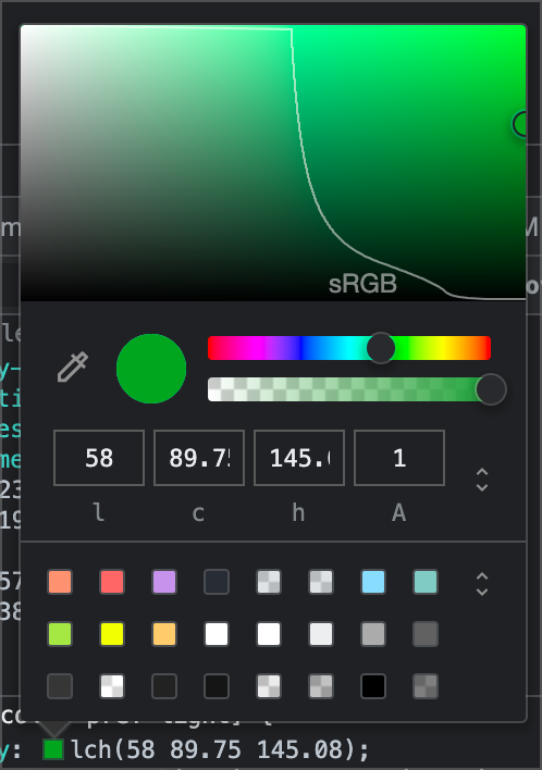
The screenshot below is from Chrome's new color picker in its dev tools. (This means you can do this experiment, too.) The curved white line shows sRGB's boundaries. Every color to the right of it has been off-limits.
Until now...
The Impact of Wide-Gamut Colors
In a cryptic sentence: "Green is no longer green." At the moment, wide-gamut colors are a novelty but as more and more sites transition to new color spaces, achieving brighter, punchier colors—sites that haven't will start to appear drab, dreary, and dull.
Green is no longer green
I know I've railed a bit on sRGB throughout this article, but it should be noted that sRGB was a hugely important technological milestone: it standardized color rendering across devices. Without it, colors wouldn't look quite right, and we'd have been watching Jerry, George, and Elaine doing nothing in the Upside Down.
I should also mention that (HDR) displays capable of showing colors beyond the sRGB color gamut didn't reach the mainstream until recently. These hardware limitations meant there would've been little motivation to bring additional, wide-gamut color spaces to the browser—no one would be able to use or see them!
Caveats aside, the real takeaway here is that sRGB isn't gonna cut it any longer. Using these wide-gamut colors, though, can seem overwhelming because there is an absolute barrage of new complex methods and syntaxes for working with them in the browser. Having an understanding of color models, spaces, and gamut makes adopting these new methods immensely more manageable. The next articles in this series will continue to expose other limits of sRGB and teach you how to use these wide-gamut colors in the browser.

Additional Resources for the 🤓
Some you must read
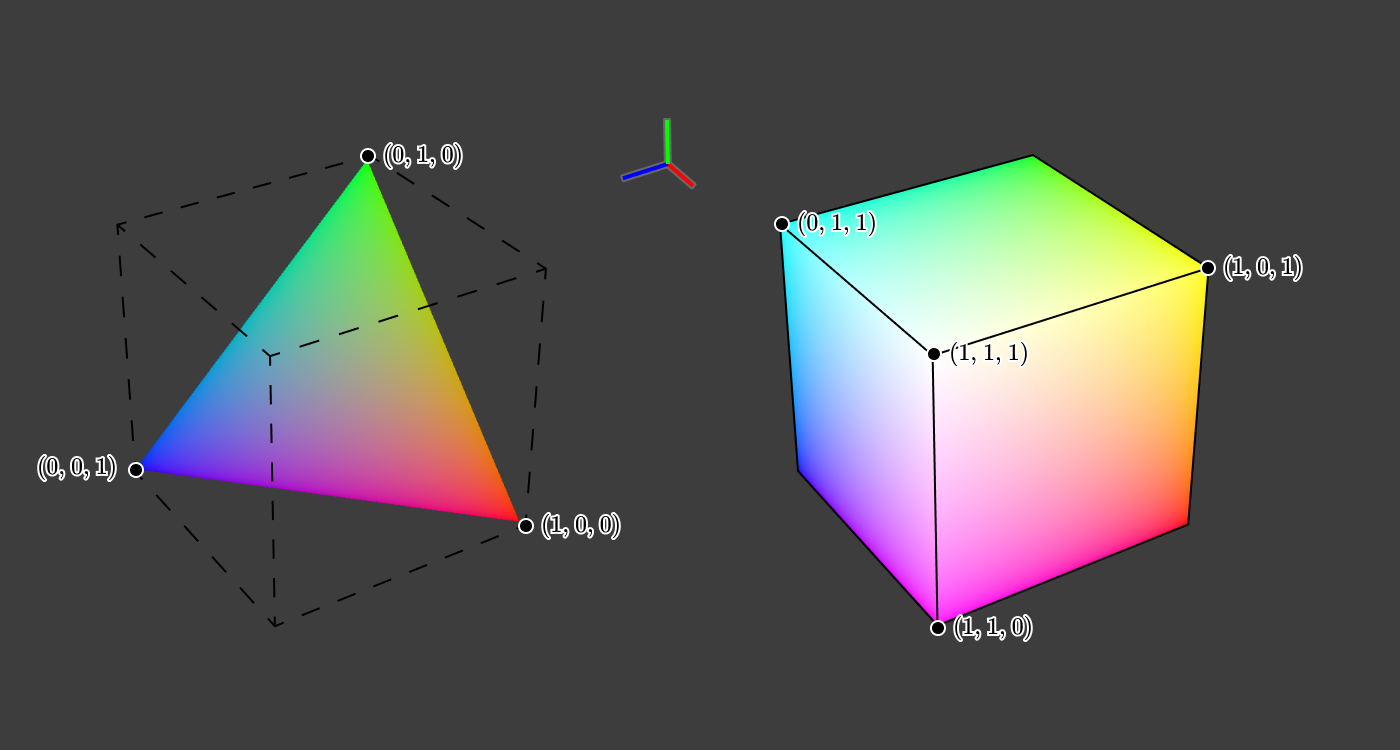
This is a pretty sweet deep dive (metamers, tetrachromats, mantis shrimp, chromaticity) by Jamie Wong, where he traces how color (#9b51e0 in particular) gets from the screen to your eyeballs.

Rune Madsen delivers a beautiful history of color theory, which I cannot recommend enough. The description of Josef Albers' work was so interesting, I'm in the middle of reading The Interaction of Color. Madsen has several additional chapters on color—they're all 🔥
History and reference

The OG proposal by HP and Microsoft to make sRGB the standard color space.

As the title suggests, an overview of color spaces and their uses.
🏆 Reward for reaching the bottom
