In my Ghost theme, Smart, I introduced an exciting feature: automatic color theming. With this feature, the entire theme's palette changes automatically based on the accent color you set in Ghost Admin. This means that not only can you customize your theme at the click of a button, but you can also completely change the vibe of your site at any time.
🚨 I built a whole color theming tool! See the post below for more:
 Ryan Feigenbaum
The technique behind this feature doesn't rely on anything Ghost specific, and, in this post, I'm going to show you how you can generate an entire UI color theme from a single color with a little bit of JS and CSS. I'll also discuss the limits and caveats of this technique as well as the rabbit hole of color I've been down since 🕳🐇
How to create an automatically generated color palette
Color palette generation begins with a single color. In Ghost, this is the accent color defined in settings. Wherever the color comes from, we need to get it into our code in a workable format.
An important point to keep in mind is that all parsing and palette generation needs to happen before the DOM is rendered. Otherwise, the user will be subject to a flash of an unthemed page (FUPA).
Getting the accent color
Ghost exposes accent color on the @site property in a hex format (like #ffffff for white). But to generate different colors and palettes in CSS, we need the color value in HSL, which stands for hue saturation lightness. This means that we need to convert the hex value using JS, but also that if you're beginning from HSL, then you can generate an entire color palette entirely via CSS—no JS needed!
To provide the HEX value to JS as soon as possible, I add it as a custom HTML attribute on the root element in default.hbs:
<html
  lang="{{@site.locale}}"
  data-color-pref="{{@custom.color_mode}}"
  data-accent-color="{{@site.accent_color}}"
></html>
Here, I create a custom attribute called data-accent-color and set @site.accent_color as the value. For example, if you had red as an accent color, this will render as data-accent-color="#ff0000".
The data-color-pref attribute enables the use of dark mode in the theme, and the automatic color theming discussed here can accommodate an entire palette for dark mode, which I'll touch on below. If you're interested in seeing how to build a dark mode toggle for your site, I have an amazing guide on it:
 Ryan Feigenbaum
Transform the HEX value
The next step is to transform the hex value into HSL, which requires running a bit of JS. (The initial code comes from this post on CSS Tricks.)
 royalfig
I first convert the hex value to RGB (red green blue).
function hexToRgb(H) {
  // Convert hex to RGB first
  let r = 0;
  let g = 0;
  let b = 0;

  if (H.length === 4) {
    r = `0x${H[1]}${H[1]}`;
    g = `0x${H[2]}${H[2]}`;
    b = `0x${H[3]}${H[3]}`;
  } else if (H.length === 7) {
    r = `0x${H[1]}${H[2]}`;
    g = `0x${H[3]}${H[4]}`;
    b = `0x${H[5]}${H[6]}`;
  }
  return [r, g, b];
}
Depending on the hex format, which can be like #fff or #ff0000, this function destructures each set of numbers to their red, green, and blue values. In the case of red, #ff0000 in hex and 255 0 0 in RGB, the ff becomes 0xff in hexadecimal notation or 255. (255 equals 100% red.)
I then take the converted RGB values and transform them again into HSL.
function rgbToHSL(rgb) {
  const [r, g, b] = rgb;

  // Then to HSL
  const sr = r / 255;
  const sg = g / 255;
  const sb = b / 255;

  const cmin = Math.min(sr, sg, sb);
  const cmax = Math.max(sr, sg, sb);
  const delta = cmax - cmin;
  let h = 0;
  let s = 0;
  let l = 0;

  if (delta === 0) {
    h = 0;
  } else if (cmax === sr) {
    h = ((sg - sb) / delta) % 6;
  } else if (cmax === sg) {
    h = (sb - sr) / delta + 2;
  } else {
    h = (sr - sg) / delta + 4;
  }

  h = Math.round(h * 60);

  if (h < 0) {
    h += 360;
  }

  l = (cmax + cmin) / 2;
  s = delta === 0 ? 0 : delta / (1 - Math.abs(2 * l - 1));
  s = +(s * 100).toFixed(1);
  l = +(l * 100).toFixed(1);

  return [h, s, l, parseInt(r), parseInt(g), parseInt(b)];
}
I didn't come up with the color math behind this, but the basic idea is that it's transforming RGB values into HSL. The function returns the HSL and RGB values, in formats that are readable in CSS.
Generating the palette
Converting color formats is the hardest part of this code. From here, though, we get to have some fun 🎨
function generateColorPalette() {
  const [r, g, b] = document.documentElement.dataset.accentColor
    ? hexToRgb(document.documentElement.dataset.accentColor)
    : hexToRgb("#ff0000");

  const [h, s, l] = rgbToHSL([r, g, b]);

  const complementaryColor = h + 180 > 360 ? h - 180 : h + 180;
  document.documentElement.style.setProperty("--primary-h", h);
  document.documentElement.style.setProperty("--saturation", `${s}%`);
  document.documentElement.style.setProperty("--lightness", `${l}%`);
  document.documentElement.style.setProperty(
    "--complementary-color",
    complementaryColor,
  );
  document.documentElement.style.setProperty("--r", r / 255);
  document.documentElement.style.setProperty("--g", g / 255);
  document.documentElement.style.setProperty("--b", b / 255);
  document.documentElement.style.setProperty("--cr", (255 - r) / 255);
  document.documentElement.style.setProperty("--cg", (255 - g) / 255);
  document.documentElement.style.setProperty("--cb", (255 - b) / 255);
}
The first part of this function grabs the accent color added as a custom data attribute in default.hbs: document.documentElement.dataset.accentColor. The hex value is immediately converted to RGB and then to HSL.
Why use HSL?
Up to this point, everything's been focused on how we get to HSL but not why. Unlike hex and RGB, HSL can be easily and programmatically modified. That's evident in this line of the function:
const complementaryColor = h + 180 > 360 ? h - 180 : h + 180;
The hue in HSL is measured in degrees around the color wheel. To find the accent color's complementary color, we add 180 to the hue, which takes us halfway around the wheel. In cases where we exceed 360, we need to subtract 180 instead.
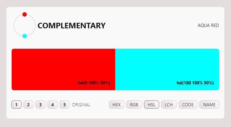
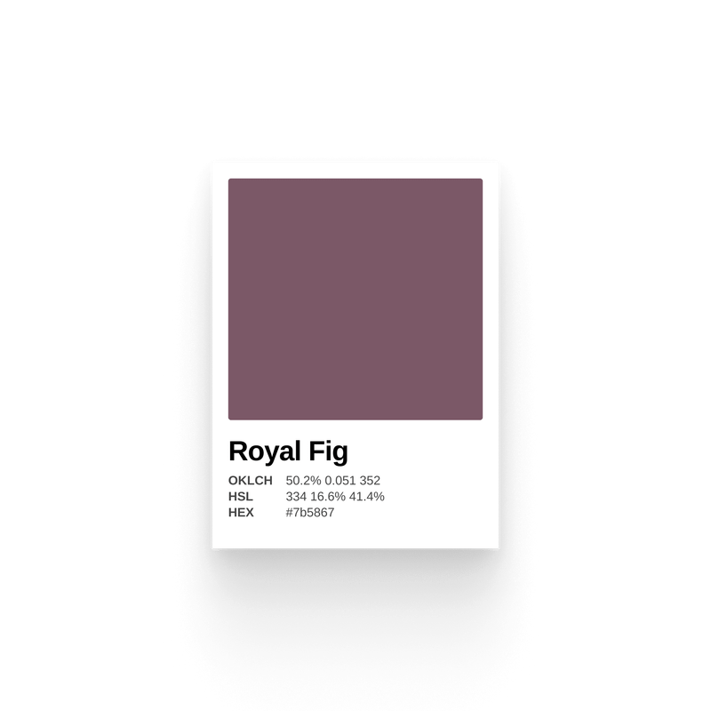
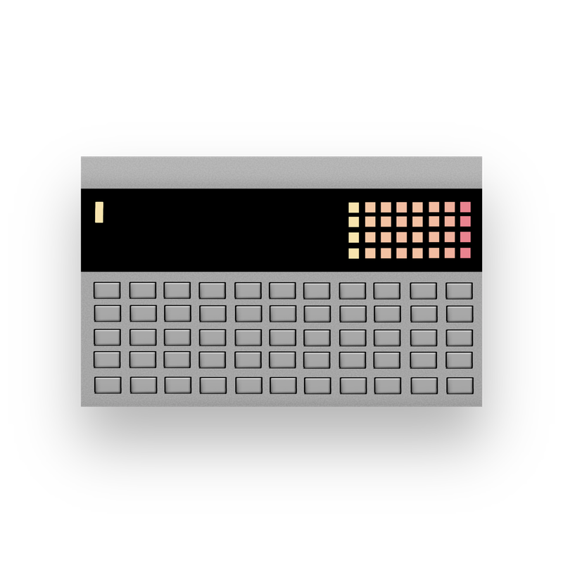
Red is 0° on the color wheel, and its complement, aqua, is 180 degrees from there. (PS: This image is a screenshot from a new app I'm building related to color palette generation and hints at the rabbit hole of color I've found myself in.)
Although I generate the complementary color here in JS, it's also entirely possible to do it entirely in CSS.
:root {
  --primary-hue: 0;
  --primary-saturation: 100;
  --primary-lightness: 50%;
  --complementary-color: hsl(calc(var(--primary-hue) + 180))
    var(--primary-saturation) var(--primary-lightness);
}
Using the CSS calc function, we add 180 to the primary color's hue to generate a complementary color. CSS is forgiving here, too, adjusting the math if your value exceeds 360 degrees.
The ability to find and modify the complementary color easily is not the only benefit of working with HSL, it's also intuitive to modify the color's saturation and lightness.
The last part of the function is to write these HSL values to the page as CSS custom properties. Four values are most important: the hues of the primary and complementary colors as well as the saturation and lightness (which is the same for both colors).
Here's an example of that syntax:
document.documentElement.setProperty("--primary-hue", 130);
Generating the Palette in CSS
The last part of generating our automatic color palette is done in CSS. Here's the magic:
The CSS is broken up into two major sections, which define separate palettes based on whether the page is in dark or light mode.
Then, variables are assigned using the HSL values. There are five types of variables created:
- Primary and secondary colors are the
accent colorand its complement. Additionally, I generate light and dark versions of these colors by using thecalcfunction to increase or decrease the lightness value, which, again, shows why HSL is nice to work with! - Surface colors define the site's elevations (based on Material Design's philosophy that higher elevations should be lighter). I use these colors for the background of the page, cards, buttons, etc.
- Element colors define the elements that appear on the surfaces, which are generally text. Here, too, there are different lightnesses available.
- Border colors define elements with low contrast (compared to the surface they're on). Generally, this means borders. Usually, you can just use an element color for this, but accommodating a dark and light mode necessitates making separate variables.
- Box shadows define shadows on elements. The advantage here is the ability to make richer shadows because you can actually tune the color of the shadow to match the surface it's being cast on.
This comes together, for example, in styling a card:
.sm-card {
  background-color: var(--surface-light);
  color: var(--element);
  border: 1px solid var(--border-color);
  box-shadow: var(--box-shadow);
}
Each of these variables reacts not only to the accent color set by the user, but also whenever the site changes from light to dark mode. It also helps to keep colors consistent across the site. The best way to try this out is to install the Smart theme on a local Ghost site. The entire codebase is also open source.


Pitfalls and Rabbit Holes
The automatic color theming works pretty well without any intervention; however, there are some caveats.
- There's no checking for contrast. While the theme design tries to skirt the issue by not relying on the accent color for contrast, the color isn't modified to ensure proper contrast.
- Dark mode colors are achieved by lightening the accent color. This means that starting with a darker color (something that contrasts well on a light background) will yield better results.
This is a post I intended to write a while ago, but as I started looking into color on the web, I learned some crazy shit. Not "crazy" in the sense that half the population sees green but calls it "blue", while the other half sees green and calls it "blue." No, "crazy" in the sense that color on the web is dull by design, HSL is a liar, and everything is changing dramatically.
 Adam Argyle
I'll be writing about all of this over the next few weeks and am working on a fun app to explore color palettes. Stay tuned and subscribe!