You know that moment when you're setting up responsive images and you get to the sizes attribute? You stare at it for a minute, then just type 100vw and move on with your life because figuring out the actual values feels like entering in your work experience after uploading your resume.

But you can't do that because images continue to represent a significant portion of page weight. From responsive image tags to advancements in image compression, native browser APIs (and frameworks) provide several strategies for making sure you don't send more bytes down the wire than you need to.
If you don't use sizes properly, you're leaving performance optimizations on the table, and you're no better than someone shipping 6,000px uncompressed PNGs.
That's why I created Size Writer, a CLI tool that generates sizes for you ✨
Wait, What Is sizes Again?
The sizes property lets you write a media query to specify which image is used at different viewports (by width). The issue here is figuring out what the sizes property value should be. You may be lucky and have a platform that does it for you, or you may be waiting for the auto keyword to be better supported, but for the rest of us, it usually means resizing the browser and seeing the size of the image and then translating that into a sizes media query.
Here's an example to illustrate how sizes works:
<img
  srcset="
    img-50.jpg     50w,
    img-100.jpg   100w,
    img-400.jpg   400w,
    img-600.jpg   600w,
    img-800.jpg   800w,
    img-1000.jpg 1000w,
    img-1200.jpg 1200w,
    img-1600.jpg 1600w,
    img-2000.jpg 2000w
  "
  sizes="(max-width: 400px) 160px, (max-width: 600px) 240px, (max-width: 1200px) 528px, 800px"
/>
With srcset we provide images of varying widths, from 50 to 2000px wide. Then, in the sizes property, we specify when they should be used. Up to 400px, use the image closest to 160px, up to 600px, use the image closest to 240px, up to 1200px, use the image closest to 528px, and default to 800px after that.
Size Writer handles this by outputting the sizes value automatically, copying it right to your clipboard, so you can paste it right into your code and move on with your life.
How Size Writer Works
The CLI tool is an npm package. Install it globally:
npm install -g @royalfig/size-writerThen, run the command in the terminal: size-writer.
The utility asks for 3 inputs:
- URL: The URL for the page you want to write sizes for. Works locally, too.
- Image CSS selector: The selector for the image you want to target, e.g.,
.hero-img img. - Available image sizes: The image sizes available in px, provided as a comma-separated list:
300, 500, 700, 1200.
Once the command runs, it uses Puppeteer in the background to actually render the website at a variety of viewports and measure the image size. It then returns a table, showing how the image size changes across viewports, and, of course, the sizes property value, computed for you.
Testing Size Writer
Let's test this out with the hero image on the 404 Media homepage.

We run size-writer:
And get back this value: sizes="(max-width: 650px) 600px, (max-width: 800px) 1000px, (max-width: 1150px) 600px, 1000px".
This says that when the viewport is below 650px, use the 600px image. Then, up to 800px, use the 1000px image. Then, up to 1150px, go back down to 600px (and use 1000px after that).
What's interesting here is how the image size goes up but then back down as the size of the viewport increases. Can you guess why that is? Let's visualize it.
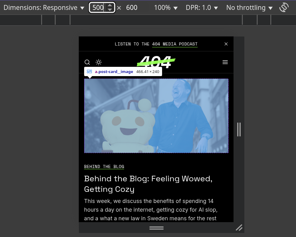
When the viewport is 500px wide, the image is ~466px. That means using the 600px image makes sense because it's the smallest available image.
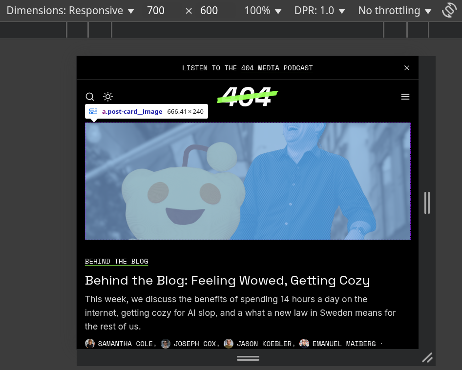
At 700px, sizes specifies 1000px. But, as the screenshot shows, the image is only 666px, so it seems like it's choosing an oversized image.
The way the algorithm works is that it always chooses an image that's larger than the one needed, so that the image is never undersized. Here, though, the choice is debatable and results, in part, from only a few available images. It'd be straightforward to update the algorithm to let you choose between "quality" and "optimization." Should I add this option?
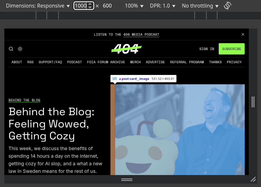
At 1000px, we see why the sizes value goes up and then down. The layout shifts at the larger viewport to two columns, making the image—perhaps counterintuitively—smaller. The sizes value follows suit by specifying a 600px image width.

Finally, at 2000px, we're back up to 1000px image width, again because the image size is above 600px. (Interestingly, if we used an "optimization" version of the algorithm, where it selected the value closest to the actual image size, it'd just be sizes="600px").
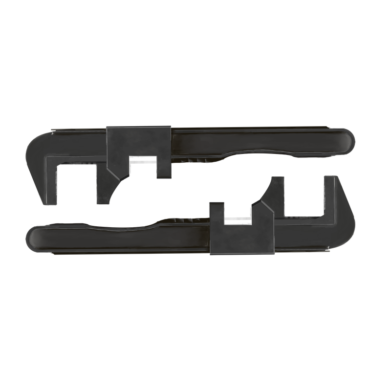
Here's another (full) example from the card on the homepage of this site:

<picture>
  <source
    srcset="
      /content/images/size/w50/format/avif/2025/03/wrenches.png     50w,
      /content/images/size/w100/format/avif/2025/03/wrenches.png   100w,
      /content/images/size/w400/format/avif/2025/03/wrenches.png   400w,
      /content/images/size/w600/format/avif/2025/03/wrenches.png   600w,
      /content/images/size/w800/format/avif/2025/03/wrenches.png   800w,
      /content/images/size/w1000/format/avif/2025/03/wrenches.png 1000w,
      /content/images/size/w1200/format/avif/2025/03/wrenches.png 1200w,
      /content/images/size/w1600/format/avif/2025/03/wrenches.png 1600w,
      /content/images/size/w2000/format/avif/2025/03/wrenches.png 2000w
    "
    sizes="(max-width: 600px) 160px, (max-width: 900px) 240px, (max-width: 1000px) 528px, (max-width: 1200px) 240px, 528px"
    type="image/avif"
  />
  <source
    srcset="
      /content/images/size/w50/format/webp/2025/03/wrenches.png     50w,
      /content/images/size/w100/format/webp/2025/03/wrenches.png   100w,
      /content/images/size/w400/format/webp/2025/03/wrenches.png   400w,
      /content/images/size/w600/format/webp/2025/03/wrenches.png   600w,
      /content/images/size/w800/format/webp/2025/03/wrenches.png   800w,
      /content/images/size/w1000/format/webp/2025/03/wrenches.png 1000w,
      /content/images/size/w1200/format/webp/2025/03/wrenches.png 1200w,
      /content/images/size/w1600/format/webp/2025/03/wrenches.png 1600w,
      /content/images/size/w2000/format/webp/2025/03/wrenches.png 2000w
    "
    sizes="(max-width: 600px) 160px, (max-width: 900px) 240px, (max-width: 1000px) 528px, (max-width: 1200px) 240px, 528px"
    type="image/webp"
  />
  <img
    srcset="
      /content/images/size/w50/2025/03/wrenches.png     50w,
      /content/images/size/w100/2025/03/wrenches.png   100w,
      /content/images/size/w400/2025/03/wrenches.png   400w,
      /content/images/size/w600/2025/03/wrenches.png   600w,
      /content/images/size/w800/2025/03/wrenches.png   800w,
      /content/images/size/w1000/2025/03/wrenches.png 1000w,
      /content/images/size/w1200/2025/03/wrenches.png 1200w,
      /content/images/size/w1600/2025/03/wrenches.png 1600w,
      /content/images/size/w2000/2025/03/wrenches.png 2000w
    "
    sizes="(max-width: 600px) 160px, (max-width: 900px) 240px, (max-width: 1000px) 528px, (max-width: 1200px) 240px, 528px"
    src="/content/images/size/w800/2025/03/wrenches.png"
    class=""
    alt="Two wrenches"
    height="2000"
    width="2000"
    loading="lazy"
  />
</picture>
This example shows the sizes attribute, but also the additional optimizations necessary for image loading on the web. There are multiple image formats, width and height properties, and lazy loading. See A Guide to Image Optimization on the Web and Image Optimization in Ghost if you're curious about any of these techniques.
Conclusion
There are most certainly better ways to do things—please let me know or make a PR if you have ideas. The tool solved my problem, and if it solves yours too, that's great. If you have suggestions for improvements (like that "optimization mode" I mentioned), I'm all ears.